Crafty Peeps, thank you for popping along to see me.
Today’s is a special post as it is all about the final challenge for my AECP Level 2 certification. It will be a long post so I have divided it into two sections – you can see section two, Altered/Upcycled Item, by following this link.
The challenge consists of two parts, which are:
- to make 4 masculine cards on the themes of Love/Thinking of You, Anniversary, Encouragement and Happy Birthday
- to upcycle/repurpose/alter an object.
In addition:
- Select any 3 components from the classes in Level 1 and 2
- Explain the components I have chosen
- Share any design tips
My blog post must include a detailed step-by-step photo
tutorial and/or YouTube video (still my nemesis, I’m afraid) and there must be
a minimum of 10 photographs of the cards and project.
Not much to do then!
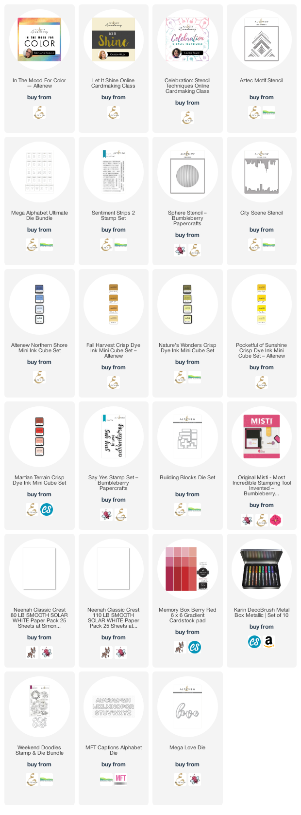
My first task was to decide which components I would include from the 20 classes I had taken so far. I love colour, so one of them had to be ‘In The Mood for Color’, from which I learned how colour really affects the feeling of a card and the message it sends.
Second was ‘Let It Shine’ – where would we card makers be without a bit of bling? A simple thing like adding a little sparkle can lift almost any card to the next level. It can provide an easy win when your mojo is flagging, and there are so many interesting ways to use the various shiny products in your stash.
And third I chose ‘Creative Stencilling’ because I love stencils! I love the ease with which stencils can change the feel of a whole card or project: got a climbing flower that looks a little lonely on the front of a card? Then stencil a trellis or a brick wall for it to climb up and you have instantly boosted your card to the next level.
Of course, it’s not possible to create without using elements from other classes: layering stamps, making your own backgrounds, inking tips and tricks, and much more along the way. The 20 classes have provided such a lot of brilliant tips and techniques.
My next task was to look through my Altenew collection to see what inspired me. I chose to interpret the brief as 4 cards that someone would send to a partner at different times of the year so I didn’t want to make the cards into a set, i.e. have them all look somehow related to each other. That made it easier to pick the stamps and stencils I would use, and gave some scope for design.
Card One – Happy Birthday
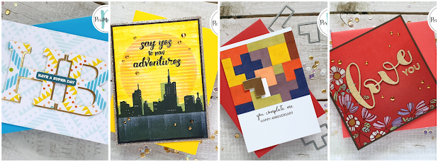
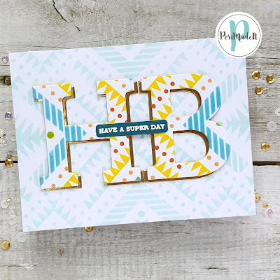
The first card I made was the birthday card. I chose the ‘Aztec stencil’ for this as it is beautifully graphic and a great pattern to repeat across a card front. Using masking tape/Post-it tape, I masked off parts of the stencil as I applied ink with finger daubers for a little more control and used my favourite ink sets to apply bold colour. I was happy with the result – it really popped, as you can see.
Tip:
When stacking die cuts for dimension, cut the extra layers in white card, stack them together and then, before adding your top layer, take an ink pad that matches or coordinates with your top layer and ink all around the edges of the stack. There will be no white edges showing around your stack.
I originally wondered whether I should make an eclipse card but I wanted a bit more contrast between the letters and the background so I inked the stencil again with Sea Glass ink. I also cut another set of letters from gold mirror card from my stash as I wanted to offset the H and B to give a little more interest to this simple design.
Tip:
When inking/stencilling/stamping for a background like this, always ink a piece larger than you need. It allows you to pattern match with the background more easily – see below.
When I inked the stencil again in Sea Glass Ink, I made sure to ink a piece that was larger than I knew I would need in the end. The reason for this is that I wanted to match my letters to the pattern underneath, but didn’t know how much of the stencil I would need to do that. So inking a larger piece gave me options.
I added the top layer to my stack and then tried the letters against my background, making sure to line up the patterns. I lightly drew around the letters to give me placement then offset the letters against the gold card. It wasn’t until I had everything glued in place that I realised the offset was to a different side on each letter! But, go with the flow – it’s actually okay and it shines!
My final step was to stamp and heat emboss a sentiment from Sentiment Strips 2 to place across the two letters. I chose ‘Have a super day’ and embossed it in white on medium blue cardstock from my stash. A co-ordinating envelope finished this off beautifully.
Card Two - Encouragement
A few gold crystal gems added some extra sparkle and a co-ordinating envelope finished this brightly‑coloured card.
Card Three - Anniversary
Card number three was my anniversary card and I was excited to use my Blocks die set for the first time.
From some thin copy paper I cut three sets of blocks – because the paper was so thin I was able to layer the sheets together and cut all three sets at once. In the back of my sketchbook I worked on arranging the pieces until I had made a complete rectangle with the blocks, and I used this as my guide whilst making the card itself.
Rather than cut blocks from several different colours of cardstock, I chose to cut two complete sets of blocks from Neenah Classic Crest Solar White 100lb paper and then coloured each block using my finger daubers and Altenew inks from the Martian Terrain, Northern Shores, Natural Wonders and Pocketful of Sunshine mini ink cube sets. I cut an extra piece in gold mirror card from my stash and two further ones of the same shape in white card, which I layered with the gold for dimension.
Using the pattern I had made as a guide (with just a couple of adjustments), I used the corner of my MISTI to help me keep the panel square as I assembled it, sticking the pieces onto a piece of copy paper to give them stability. I generated my sentiment in MS Publisher (easier placement than Word) and printed it onto 300gsm white cardstock, which I folded to make a card base. I adhered the ‘puzzle’ panel onto the card, leaving a small border of white at the top , and then attached the ‘missing’ piece on top, leaving some of the empty space visible below to give the impression that the puzzle needs to be completed.
Another co-ordinating envelope and card three was complete.
Card Four – Love/Thinking of You
The fourth and final card was on the theme of Love and, actually, I found this the most difficult to create of all the cards as I didn’t want anything too floral, too cute, too masculine, too feminine…need I go on?
Eventually I decided simply to begin and see where the process took me. I took a 6” square piece of pale red (i.e. not too saturated colour) card from a Memory Box Gradient Pad and began blending ink onto it with my blending brushes, using Velvet, Crimson and Grape crisp dye inks, until I achieved the depth and gradient I was looking for.
I added a few sparkly crystals from Lucy’s Cards and made a
co-ordinating envelope, as always, to finish off.
Thank you for sticking with this long post - I really appreciate your time. Don't forget to check out part 2 here.
Until next time, keep crafting.
Please note that some of the links below are affiliate links and if you follow them and make a purchase I might receive a small commission, at no additional cost to you. This helps to support my blog.
 >
>


These are brilliant Peri. So many people interpret 'masculine' to mean black, blue and grey with images of fishing or cars, which makes it so narrow and difficult to find something original for those who don't identify with the stereotypes but are still masculine. The colours and images you've chosen are so refreshing to see and fit the brief perfectly. Once again you've shown how original and talented you are.
ReplyDeleteThank you, Niki - your encouraging words are always most appreciated x
DeleteHow fabulous!! Amazing job!!!
ReplyDeleteThank you, Lori, I really appreciate your time and kind words x
DeleteStunning!! Perfect out of the box for guys :-)
ReplyDeleteThank you, Libby - I'm so glad you like them 😊
DeleteYou have done a fabulous job! I love your take on the challenge. Love the individuality of your cards too. Thank you for submitting your wonderful work to the AECP assignment gallery.
ReplyDeleteThank you, Erum. I really enjoyed making these - so glad you like them.
ReplyDelete