19 December 2020

Yaay!

I'm delighted to be able to tell you all that I have passed my AECP Level 1! 'Nuff said, really. I'm feeling fab and ready to get stuck into Level 2.

Thank you for taking the time to read my posts along the way and for the kind comments you have left. 


For details of this card, watch out for my next post.

Until then, stay safe and keep crafting

Peri x


14 December 2020

AECP 1 - Final Project Submission

 Hi Crafty Peeps, I hope you are all staying well. Thank you for taking time to stop by today.

Well, it’s here, my AECP Level 1 final project! After taking the first 10 classes, I must complete a cardmaking challenge to demonstrate what I have learned along the way. My challenge was to make a set of gender-specific cards, plus packaging, to give as a gift. Additionally, I had to include a recycled element in the final product.

Needless to say, this blog post is going to be really, really long (almost a book!) so I have split it into three separate posts: this one, and one for each set of cards. The preamble will be in this post, so grab a drink, maybe a biscuit (cookie) or two, and settle in for a read.

THE CLASSES

I thought long and hard about which of the classes to focus on, as there were interesting techniques in each lesson, and inspiration for all sorts of directions to explore, but I finally chose:

Celebration Stencil Techniques

This was a great class, led by Laurel Beard. In Lesson 1 she encouraged students to create their own stencils with die cuts, which I love doing, and you can see this in both of my geometric cards where I cut triangles and circles to use alongside the stamp sets.

Lesson 4 is all about using a stencil to add further interest on top of an ink blended/painted background. I stretched this further and used a stencil over another stencilled background – you can see this in both of the grid-stencilled cards, where I have used another stencil to apply transfer gel and foiled details over the top of the stencilled background. Just in case it isn’t obvious, I love stencils!

Clean and Simple Boutique Cards

I chose this class, led by Jennifer Rzasa, because I’m not very good at ‘clean and simple’ and thought it would extend the challenge for me to produce at least a couple of cards in this style - see whether you think I hit the right style with the masculine ‘Friend’ card and the feminine vase card.

Lesson 3 - Foiling/Metallic Details – was the inspiration for adding foiled elements to some of my cards, a new technique for me.

Lesson 2 – Stamped Backgrounds – inspired me to use stamps to create my own paper to wrap the lids of the boxes I made for packaging.

Seasonal Scene Building

In this class Nichol Magouirk offered lots of tips about layout and building layered scenes. I took inspiration from both Lesson 4 - Framed Scene, and Lesson 5 - Window Scene and applied this to cards in both sets.

I think every class that formed part of my Level 1 experience offered inspiration, whether by refreshing those skills I already had, or encouraging me to use new techniques. In particular, I took inspiration from the following classes:

For the Guys

I love Geometrics (Lesson 1) so was able to incorporate these in both sets, and Interactive (Lesson 4) gave me the inspiration for my fridge magnet cards.

Let It Shine

Who doesn’t love a bit of bling? This class with Carissa Wiley confirmed that there is rarely an occasion where you can’t introduce a little something shiny. Her use of embellishments (Lesson 3), metallic cardstock (Lesson 5) and foil (Lesson 6) taught me not to be afraid of getting my shine on!

Layering 1 and 2

These two classes were obvious inclusions. There aren’t any particular lessons I would refer to, but the general instruction and techniques for layering the stamped images are so helpful. I even found the general principles useful when I came to ink up the layered stencils on my cards, having become more confident with placement and accuracy, etc.

THE CHALLENGE

The challenge was to create two sets of cards, gender specific, and package them for gifting. Each set had to be cohesive and creative, and, of course, the cards must showcase Altenew products.

I wanted the two sets of cards to have something in common, and I also wanted each set to have its own common theme. I decided that I would use a stencil on every card, and that the sets would each have their own consistent colour scheme. Where possible, I would ‘mirror’ the stencil and produce a masculine/feminine version of the card (and I achieved this on three cards). I decided not to use the usual gendered colour schemes of blue and pink and instead chose a coffee palette (Sand Dunes and Rocky Shore inks) for the masculine cards and a fresh green palette (Firefly and Lime) for the feminine cards. 

I also made the decision to produce square cards, a format which I love but which not many of my American friends seem to use. Here in the UK square cards are easy to get hold of, but I tend to make my own card bases (300gsm/140lb cardstock) and envelopes for ‘special’ cards. The cards in both sets are 14.5cm (512/16”) square.

I will list the products used at the bottom of each post. In the following descriptions, all products are from Altenew unless otherwise identified.

To see how I made each set, please follow the links below:

Masculine Cards       FeminineCards

AECP 1 - Final Project - A Set of Masculine Cards

It was this set for which I had originally had an idea, as I have two sets of stamps that I thought would be perfect for masculine cards – Coffee Love and Coffee With A Splash – and I thought the sentiments included were great. So it was with these that I started.

Card One

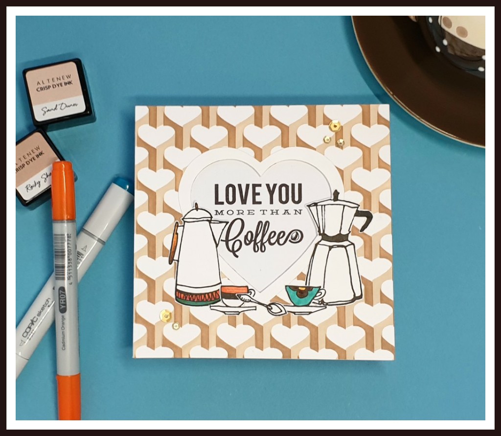
It was the sentiment that was the initial inspiration for this card, particularly as it mirrored the stamp set I intended to use for the feminine card set. And love is hearts, isn’t it, so what better than the Heart Builder stencil for this card. I gave the back of the stencil a light coat of Crafters Companion Stick and Spray temporary adhesive, just to make sure it wouldn’t move during inking.

Tip: Even though it is a light temporary adhesive, I make sure to touch the sprayed surface to a cloth to remove a little of the tackiness from the glue before setting the stencil down on the paper. This ensures that the stencil won’t pull at the surface of the cardstock when it is removed – you don’t want to ruin all your hard work!

Using my chosen inks – Sand Dunes and Rocky Shore - I stencilled the pattern onto a piece of Neenah 216gsm (80lb) Classic Crest Solar White cardstock, before cutting out a heart-shaped aperture from the stencilled piece and a co-ordinating frame from another piece of Neenah Solar White. I placed the stencilled piece on top of the card base (without adhesive at this stage) and lightly drew around the inside of the aperture to give me a place marker for the sentiment stamp. I then put the stencilled piece to one side whilst I completed the rest of the elements. This allowed the ink to dry thoroughly.

With my Original MISTI (without which I could accomplish so much less) and some Jet Black ink, I stamped the sentiment I had chosen from the Coffee Love stamp set onto the card base, within the place marker. I stamped it a couple of times to make sure to get a really nice solid black impression. Just to add a little detail, I drew a small coffee bean in the swirl of the 'e' of the word 'coffee' - I think it's quite cute!  Using the same ink, I stamped two coffee pots, two cups and a spoon from the Coffee Love stamp set onto a separate piece of Neenah cardstock and coloured a little detail with some Copic markers.

Finally, I cut a piece of white craft foam to 14cm square and marked out where the heart needed to be cut out to allow the sentiment to show through from behind.

Tip: I like to use craft foam instead of 3D foam pads or tape if I need to support a large piece on the front of a card – I feel it gives more stability, particularly if your card is being sent through the mail.

I used some Tacky Glue to adhere the foam to the stencilled piece, and some strong tape to stick the foam to the card front. I then arranged my coffee pots and cups around the bottom of the heart frame – I love how the coffee pots ‘look’ at each other YY. The spoon joined the two cups to complete the scene. 

There were, of course, sequins – need I say more?

Card Two


I think there is always room for a little humour in our cardmaking, and this sentiment, also from the Coffee Love stamp set, made me giggle. It also made me think of a fridge magnet – just the sort of corny humour you’d find adorning many a fridge – and the idea was born. This card has a fridge magnet attached to the front, which can be removed and kept once the card is no longer needed.

The card was very straightforward to make. I used the Pile of Presents mask/stencil to stencil blocks of colour – Sand Dunes, Rocky Shore and Lagoon – across a piece of Neenah 216gsm (80lb) cardstock. I moved the stencil around the page and allowed the blocks to overlap so as to cover the card randomly rather than in straight lines. Then I cut a rectangular aperture and frame, in the same way as I had done with the previous card, and mounted the stencilled piece onto some craft foam and then onto the card base, again as before.

For the magnet, I die cut a smaller rectangle from Neenah Solar White and coloured this direct to paper with my Sand Dunes ink pad. Then I took the ‘coffee stain’ from the Coffee With A Splash stamp set and stamped this in the corner of the rectangle with Espresso ink, and set aside to dry.

I used the die to make an impression of the correct size of rectangle in a piece of 2mm (1/16”) thick board – the board was too thick for the die to cut through but this way I could mark the size accurately. I then used my craft knife and ruler to cut the shape out fully. Taking my Espresso ink pad, I inked directly one side of the board so that it was well covered, taking care to also cover the edges of the shape as well. I put this aside to dry for a few minutes, and then attached the Sand Dunes rectangle to the uninked side of the board with a thin layer of Tacky Glue. The whole thing then needed to dry completely before I could go any further. (I used the time to work on the next card.)

Once properly dry, I placed the piece in my MISTI and stamped the sentiment on top of the coffee stain with Galactic Stream ink, stamping twice to ensure a crisp impression.

Note: I ended up making this magnet a second time – these are the instructions for the successful second attempt. The first time, I stamped the sentiment on the Neenah piece before adhering it to the board with wet glue, resulting in a very slightly blurry outline. Even though I went ahead and finished the first attempt, I found I just couldn’t leave that blurry outline so made the whole thing again, waiting to stamp the sentiment until after everything had dried.

Once the sentiment was dry, I covered the top of the whole piece in Versamark ink, applied a coat of ordinary clear embossing powder, and heat set it. Once cooled, I reapplied a layer of Versamark and this time used Wow Ultra Thick Embossing Powder to coat the top. Once heat set, this gave a thick, shiny, smooth finish to the magnet, just what I wanted.

I applied two short lengths of Stix2 self-adhesive magnetic strip to the back of the board, and carefully measured the distance between the two. I cut another piece of board to that measurement, and just slightly shorter than the length of the magnet. I pushed this board between the two magnetic strips so that it fitted well (though not tooooo tightly!) and then applied a little Tacky Glue to the board strip only. I centred the magnet in the aperture on the card front and pressed firmly down, though careful not to damage the embossed front. I let this dry for a good while and was then able to remove the magnet and replace it with ease. For good measure, I ran a little temporary adhesive tape down that middle board strip to hold the magnet in place for gifting. It will still lift away easily from the card but won’t fall off in the envelope.

 Card Three

 No coffee pots for this card, but I used the same ink set. This time I coloured a piece of Neenah 216gsm (80lb) Solar White card with Sand Dunes ink, straight to paper with the pad, and put it aside to dry. I used the Mighty Corners stencil and masked off the last two longest strips with some Post-it paper as I didn’t want to ink these. I used each of the four inks in the Coffee Break ink set (starting with the Sand Dunes again for the smallest stripe) to ink the first four stripes of the stencil to give the impression of a ‘v’ necked sweater, using The Greetery’s Knit Wits stencil with Rocky Shore ink to add some knitted pattern.

On another piece of Neenah, I stamped the bow tie from the Thanks Dad Mini Stamp Set in Lagoon and Galactic Stream inks, and fussy cut it out, right on the line. I swiped the Galactic Stream ink across a scrap of Neenah to give a solid colour and used this to cut out another slightly larger tie shape, which I adhered only under the centre knot part of the stamped image, so that I could manipulate the ‘wings’ of the tie to give some dimension. I stuck this onto the ‘sweater’ just below the second stripe.

I stamped the sentiment from the Thanks Dad stamp set with Espresso ink onto a scrap of Sand Dunes inked paper and matted it onto a small piece of gold mirror card. I popped this up on the front of the card and added some Rose Gold Liquid Pearls drops.

I kept coming back to the card as something wasn’t right but I couldn’t work out what. Suddenly it came to me – the ‘neckline’ wasn’t right, so I cut away the first stripes to leave a white ‘shirt’ behind the ‘v’ neck – much better.

Card Four

This is probably the most straightforward of the cards in this set – just a little foiling and die cutting, really. I think it meets my personal 'clean and simple' challenge, too.

I used the Grid Stencil and Sand Dunes ink to create a simple background for the card.  I laid the Splatter Stencil over the grid stencilled piece and applied some Deco Foil Transfer Gel Duo, and set the piece aside to dry.

Tip: Don’t be impatient to move on to applying the foil. If the transfer gel is not completely dry when you apply the foil, you will end up with a patchy result, not at all what you’re expecting. And don’t ask me how it know…

Meanwhile, I used the Mega Friend Die to cut the word ‘friend’ four times – two from white card, two from brown card – and layered these up for added dimension. I think in hindsight I would have preferred to use a glossy brown cardstock, as it would have had a little more impact against the background, but I didn’t have any in my stash and by the time I realised, it was too late to heat emboss, which would have given the shine I realised I was looking for.

I swiped some Sand Dunes ink directly on to a scrap of Neenah and stamped the sub-sentiment ‘You are Awesome’ in Rocky Shore ink. The sentiment is from the Kind Reminders stamp set.

Once I was sure the transfer gel was completely dry – it goes completely clear and slightly tacky – I laid a piece of Rose Gold Deco Foil Transfer Foil over the whole design, sandwiched the whole piece within a folded piece of vellum, and ran it forward and back through my Spellbinders Platinum Six die cutting machine – I used my metal shim to ensure plenty of pressure was applied. Then, heart slightly in mouth, I gently peeled back the foil to reveal a beautifully foiled splatter across my grid background. Result! I could also have used a laminator for this process, with exactly the same gel and foil, but my laminator doesn’t get hot enough to properly transfer foil – guess what’s on my Christmas list!

To assemble the card, I adhered the ‘friend’ die cut at a jaunty angle and popped the sub-sentiment strip up on some 3D foam pads. Voila! I hope I’ve captured the shine of the foil in the photograph.

And finally, for this set at least…

Card Five


I love geometric shapes and frames and I think this card is one of my favourites. I have the Trigonometry stamp and die set and I use it a lot for masculine cards, and thought it was perfect for a final ‘strong’ card. But in the end I didn’t use the stamp at all, opting instead to use the die set and cut some stencils to work with. I also have an triangle frame die set (I've had it ages and can't remember where it came from), which I used to extend the range of sizes of triangle I could stencil. (I also used this die set to cut the thin gold frames.)

Then it was just a matter of using my homemade stencil to cover a piece of Neenah 216gsm (80lb) Solar White card with a variety of triangles in Sandy Dunes, Rocky Shore, Lagoon and Dew Drops inks. The result appears random, but, in fact, I took care when placing the triangles to get an ‘organised jumble’ of colours, sizes and types.

I chose the ‘Fabulous’ sentiment from the Birthday Bash stamp set and used my MISTI to stamp this over the largest triangle with Jet Black ink. I made sure to stamp twice to get a good crisp image.

I cut some triangular frames from gold mirror card and added a couple of these, including the solid gold centre piece, as accents. I also popped on a few gold crystals, because why not?

Thought you’d finished? Oh no, because there is, of course:
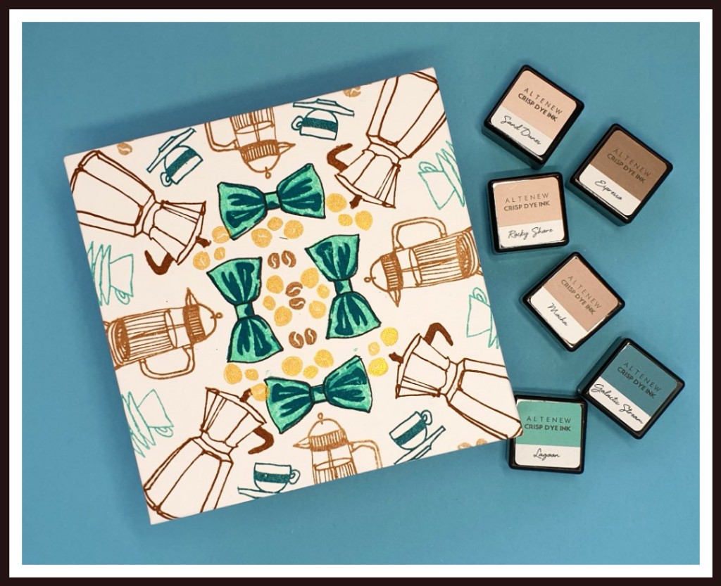
The Packaging


The second part of my challenge was to create the packaging for each set, and this was such fun. I love making boxes and felt that a simple box with a decorated lid would be perfect for these square sets.

Because of the lockdowns we have had over here in the UK, I’ve been shopping online and from the parcels through the post I had plenty of cardboard to help me meet the third challenge, to recycle something.

I had intended to make a video to show the process of making the box and covering it, but I'm afraid time was against me, given the steep learning curve it would have entailed.  

I made a double-walled box and lid, which gives the box additional strength. The paper I have used to cover the lid, for both sets in fact, is stamped to co‑ordinate with the card set in the box. 

Tip: I always like to insert a ribbon in the box base, to assist with lifting the contents out. It’s a simple thing to do, but adds a real touch of luxury to your gift.


So, that is the masculine set completed. Click here to see how the feminine set turned out.

Products used for this set

13 December 2020

AECP 1 - Final Project - A Set of Feminine Cards

The idea for this set of cards was that they would ‘mirror’, where possible, the masculine cards I had made, and I achieved this on three of the five cards. The sentiment for the first card in each set was my initial inspiration for the whole project and helped me to start creating.

Card One

I was able to directly mirror the masculine card with this feminine take on the same design. I used the Heart Builder Stencil and Firefly and Lime inks to create the background, and cut the heart and frame as I did for the masculine card. I stamped the sentiment from the Cake Love stamp set in the heart-shaped aperture before using some craft foam to pop up and support the stencilled piece on the card.

I used my MISTI to stamp a set of cakes with the layered stamps from the Cake Love stamp set. I chose a vibrant orange palette to go with the green inks, so the cakes are layered with Peach Perfect and Orange Cream inks. I fussy-cut each cake and adhered them around the base of the heart. A few orange sequins from my stash completed the look.

Card Two


This card is the mirror of the fridge magnet card in the masculine set, and is made in exactly the same way. The Pile of Presents Mask Stencil is really useful and, with the addition of Orange Cream to the Firefly and Lime inks, makes for a bright and zesty background to this card.

The focus is, of course, the removable fridge magnet. I needed an amusing sentiment for the magnet but couldn’t find just the right one among my many stamps. The only thing left to do was to create and print my own, so that’s what I did. This meant that the sentiment was already on the front of the magnet when I came to glue it to its board, but, thankfully, there was no bleeding. Once the glue had completely dried, I used the Cake Love stamp set for the beautiful layered cakes, for which I used Orange Cream ink, with a touch of Autumn Blaze shading. 

I mounted the magnet onto the card in exactly the same way as I had done with the masculine equivalent, then added a few orange sequins onto the front of the card, because I think there is now a law that every card should have bling!

Card Three


This card is a departure from the ‘mirroring’ idea I had, simply because I wanted to include a feminine floral card in this set.

On a piece of Neenah 216gsm (80lb) Solar White card I used the Deco Wallpaper Stencil and Firefly ink to create a background. Now, usually I would use the stencil the ‘right way up’, i.e. with the points facing down, as shown in the product description on the Altenew website, but I wanted a different look so I turned it sideways, with the points facing left. Then I cut out a portion along the lines of the pattern and created a frame for the empty space from another piece of Neenah. Before adhering this patterned piece to the card front, I took the smaller leaf spray from the Dot Art stamp set and stamped it in Firefly ink in what would be the open space on the card front (i.e. behind the cut away portion of the stencilled piece). I attached the patterned piece directly to the front of the card base – no craft foam or 3D foam pads this time.

The focus of this card would be the flower, and I chose the new Sparkle stamp set for this. The flower is a five-step layering bloom, so it is a perfect example of what Altenew do best. I chose to use the Goldfish Tails ink set, and began the layering with Peach Perfect, moving through the set as the layers got darker. I popped a dot of Dandelion Nuvo Crystal Drops in the centre and set it aside to dry whilst I stamped my leaves. I used a combination of Lime and Mountain Pine for the leaves.

I’ve been experimenting with foiling my own sentiments recently, and the sentiment on this card is one of my own. It was printed on a laser printer (that’s the key) and then I laid some gold foil over it and sandwiched it in a piece of folded parchment and ran it through the laminator – oh, about 7 or 8 times, that’s all (snarky). But it did the trick and has given me confidence to try this more often, particularly if Santa brings me a hotter laminator!

I arranged the leaves and flower as I wanted them and used a little Press & Seal to pick them up and keep them in place whilst I applied some glue. I glued the leaves directly to the card but chose to pop up the flower (and the sentiment) with some 3D foam pads, for a little dimension.

No bling to see here – but there are some dew drops from my stash.

Card 4

This card mirrors the masculine ‘Friend’ card, in that it uses the Grid Stencil for the background. 

I used Bundled Sage Distress Oxide Ink for this background, as my Firefly ink was running dry and I didn’t have a re-inker to hand. The colour isn’t a match, of course, but it still looks like part of the set and the strength of the vases and grasses draws the eye away from the background, in any event.

Once the ink had dried on the background, I laid the Modern Vases Mask Stencil over it and used some Deco Foil Transfer Gel Duo to prepare three of the vase shapes for foiling and set the piece aside to dry. Once the gel was properly dry, I laid over some gold foil, sandwiched it between a folded piece of parchment and ran it forwards and backwards through my die cutting machine. The foil peeled away to leave three beautifully foiled vases on top of the stencilled grid.

I used the Wildflower Doodles stamp set and some Versafine black ink (because I was stamping over Distress Oxide ink and I find that Versafine works better to cover it) to add a few sprays to each of the vases, concentrating the clusters in the centre vase to draw the eye in.

I popped one of my own foiled sentiments across the bottom of the card and added a few black/gold crystals from my stash. I really like the clean and simple vibe of this card.

And finally (again)…

Card Five

The feminine version of the masculine triangles card is this colourful circles card. I used the Trendy Circles Stamp Set for this one, alongside a handmade stencil of three circle sizes. 

The colour palette was Firefly and Lime with Peach Perfect, Orange Cream and Autumn Blaze. I also threw in some gold heat embossing on the textured circles, which mirror the gold triangular frames in the masculine version.

I chose the same sentiment from the Birthday Bash stamp set as I had used on the masculine card, and stamped it with Jet Black ink, using my MISTI to make it easy for me to stamp it twice to get a nice crisp image.

A single gold frame encircles the sentiment and a scattering of gold sequins (it’s the law, honest) finishes off the embellishments.

I love the simple ‘chaos’ of this card and think it is a perfect companion to the masculine version.

Okay, peeps, you know what’s coming…

The Packaging

The box is made in exactly the same way as that for the masculine set, but the base is covered with lime green paper, with hand-stamped co-ordinating paper for the lid. It feels great to have produced not only my own box, but the paper covering it too, and I think this really compliments the contents well.


Products used for this set

Some of the links below are affiliate links. If you click through and make a purchase, I receive a small commission, at no extra cost to you. This helps towards maintaining my blog. Thank you for your support.


So, that’s the completed submission – 10 cards, two boxes and a lot of writing! I can’t tell you how much it means that you have stuck with me for the past few weeks, and all I can do now is sit back and wait for my feedback.

I’m off to grab a cuppa and put my feet up. Stay safe and well, crafty peeps, and, until next time, keep crafting.

Peri x