15 January 2021

Oh! The colours! - Paperplayers January Challenge

Hello Crafty Peeps! I've found another card challenge that I shall follow, at the Paper Players blog. This is another weekly card challenge, and this week they have a colour challenge:


These are some of my favourite colours and a lovely selection for me to work with, so this is what I came up with:


I know my purple isn't quite as vibrant, but it's the best match I had in my stash. I used the Sparkled stamp set from Altenew for the purple flower and their Modern Blooms floral stamp set for the mustard ones. (The Modern Blooms stamp set, dies and leaf stencil were free with the Altenew magazine, issue 1, April/May 2020.) The inks are shown in the photograph, though I did add Misty Morning too, for the lighter dotted leaves (from the Dot Art stamp set). 


I wish I'd had a more vibrant purple - I can feel a purchase coming on!

I didn't have any co-ordinating cardstock in my stash so I swiped the Grape Agate ink pad across a strip of paper and then heat embossed the sentiment, from Avery Elle's Banner Bits stamp set, in white. I like the dark strip against the lightness of the background - it balances the dark flower at the bottom. 


I couldn't resist adding a selection of matching crystals from my stash - lots of my embellishments are ages old, so I couldn't even guess as to where they are from!

So there you have it, and I hope you and the Paper Players team like my submission.

Thank you for stopping by - please leave a comment to let me know you were here. 'Til next time, stay safe and well, crafty peeps, and keep crafting.


Supplies:

Please note that some of the links below are affiliate links and if you follow them and make a purchase I might receive a small commission, at no additional cost to you. This helps to support my blog. 


Continuing My AECP Journey - Beyond Basic Backgrounds

Hello Crafty Peeps - I hope you are all safe and well, and thank you for visiting. 

If you've visited before, you will know that I recently passed Level 1 of the Altenew Educator Certification Program. I was delighted to have completed the first level, which means that I can now move forward to Level 2, a further 10 classes, each with between four and six lessons, and a final project for qualification.

I thought I'd kick off with Beyond Basic Backgrounds, a fun six-lesson class taught by Lydia Evans, who explores and demonstrates different ways to produce interesting backgrounds that could also become the focus of your card.

For this class, I combined inspiration from lesson 2 (using a grid for a repeating pattern), lesson 4 (watercolour and wax resist) and lesson 5 (water bleaching). I cut my own stencil using a grid to line up hexagon die cuts, and cutting between these shapes with a ruler and knife to complete the pattern. 

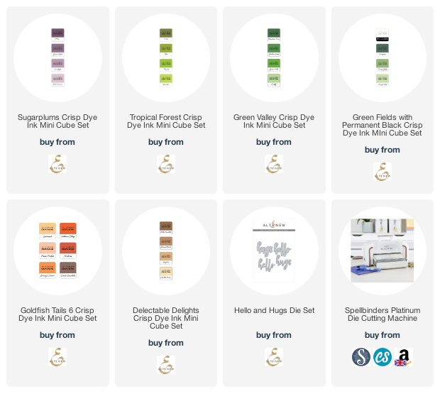
I applied some repositionable adhesive to the stencil and then attached it to a piece of Bristol Board. I used some Altenew Crisp Dye Ink mini cube inks as watercolours, by smooshing the pad onto an acrylic block and picking up the colour with a water brush. I used plenty of water to get a good blend and went to town with lots of colours from my various green and brown sets, until I had the effect I wanted. Then I used some clean water to drip/splatter the background to create bleached areas. By this time the stencil was pretty wet and some of the wet colour crept under, but it didn't bother me too much as it added to the overall feel of the background. 

I removed the stencil and then used my metallic paints to spatter a little silver (which looks more blue than silver!) and gold, and then dried everything thoroughly with my heat gun. There was a little warping, but not as much as I had expected, so I placed the piece between clean copy paper and ran it through my Spellbinders Platinum, using the metal shim to make sure sufficient pressure was applied, and this flattened things out nicely. I left it all for 24 hours, too, before making it into a card. 

The next day I mounted the background onto a 300gsm A6 card blank. I wanted there to be a little texture to the card, but nothing that would detract from the overall look, so I took some parchment and cut four small hexagons, which I placed over four of the 'cells' in the background. This diffused the colour but allowed it still to be seen. As I looked at the card the word 'connection' came to mind - I think because of the cell-like structure created by the white lines, so I added a couple of narrow gold mirror card strips to the cells with the parchment, to connect them to each other. Then I cut the 'hello' from the Hello and Hugs die set, twice from white card and once from gold mirror card, glued and stacked them and placed the finished word to the right of centre. I thought 'hello' was the perfect start of any connection.


There are, of course, sequins.

I hope you like it - I think, it's quite an unusual card, which shows that your backgrounds don't always have to be the 'supporting act'.

Stay safe and well, crafty peeps, and keep crafting.


Supplies:

Please note that some of the links below are affiliate links and if you follow them and make a purchase I might receive a small commission, at no additional cost to you. This helps to support my blog. 


02 January 2021

Welcome to 2021!

Hello Crafty Peeps! We made it - it's 2021 and my wish is that you all stay healthy and happy this year. 

I took a break from crafting over the holiday season - I packed all my stuff away (honest, I did - all of it!) and haven't yet made a card this year. However, just before Christmas I made a set of three cards using Altenew's Bold Floral Drape stamp set, which I'll show you today. All the supplies are linked below. 

This stamp set is great for backgrounds but also has individual solid flowers that can either be used to fill in the flowers of the background stamp or as separate single flowers. I have to admit that I didn't set out to make the three cards at all. I was stamping the large stamp for the first time and used a neutral grey (Distress Oxide Weathered Wood) just to see the stamped image. I hadn't inked the stamp particularly thoroughly, nor had I conditioned the stamp in any way, so the result was a little patchy and I liked it so much that I repeated it! 

Card One


This is quite a simple card (for me, at least!). The sentiment is one of my own, printed on a laser printer and foiled through a laminator. I shall make more of these, I think - love having foiled greetings to hand.


I chose some gold mirror card to cut a frame from the Altenew Crystal Frames die set and mounted it all onto a grey card base. I like gold and silver together - I like the warmth that the gold gives.


I made an envelope from some matt silver paper and a few clear sequins finished off the card. 

I was inspired by this card to 'ramp up' the design so I made the second card below.

Card Two
For the second card I mounted the background onto grey card, as before, and added some colour by stamping a few of the separate flower images in Altenew Ruby Red and Orange Cream inks. I haven't yet got the co-ordinating die set so I fussy cut the flowers out. 

I rifled through my dies and found this MFT Celebrate die, which I cut from silver card and twice more from red card. I stacked the sentiment die cuts, very slightly offsetting the silver layer so that a touch of the red card could be seen, to pick up the red from the flowers. 


I played around with the layout until I was happy with my placement and then added a few orange sequins from my stash to compliment the orange flowers. 


I was really pleased with this 'amped up' version. You could use all sorts of colours for the separate flowers, and you could make the background more or less vibrant...which leads me to the final card.

Card Three
I wondered what the background would look like stamped in a really vibrant colour, with the separate flower stamps used to fill in the white spaces. I also wondered whether the background stamp would lend itself to being extended, to fill a slimline card, for example. So, with the help of my trusty MISTI, a bit of jiggling around and practice stamping, I managed to get the result I was looking for:


This stamp set is not a neat and tidy set - its charm is in its fluid design - so the flowers don't completely match the empty spaces. I used Distress Oxide Salty Ocean for the bold blue background layer, and Dried Marigold and Picked Raspberry for the beautiful accent flowers. I chose card from my stash to cut the Peony Dream 3D flowers, which I love, and stacked these towards the top third of my card. 


The foiled sentiment is another of my own.


I made a matching envelope and, just for a little extra, I added a scrap from the patterned piece to the front of it. 


And here they are together, simple, amped up and WOW! It just goes to show, though, what you can achieve with the same stamp set, and I'm delighted with the results. 

So, until next time, my crafty friends, stay safe, stay well and keep crafting. 

Peri x

Supplies:
Some of the links below are affiliate links. If you click through and make a purchase, I receive a small commission, at no extra cost to you. This helps towards maintaining my blog. Thank you for your support.