The idea for this set of cards was that they would ‘mirror’, where possible, the masculine cards I had made, and I achieved this on three of the five cards. The sentiment for the first card in each set was my initial inspiration for the whole project and helped me to start creating.
Card One
I was able to directly mirror the masculine card with this
feminine take on the same design. I used the Heart Builder Stencil and Firefly
and Lime inks to create the background, and cut the heart and frame as I did
for the masculine card. I stamped the sentiment from the Cake Love stamp set in
the heart-shaped aperture before using some craft foam to pop up and support
the stencilled piece on the card.
I used my MISTI to stamp a set of cakes with the layered
stamps from the Cake Love stamp set. I chose a vibrant orange palette to go
with the green inks, so the cakes are layered with Peach Perfect and Orange
Cream inks. I fussy-cut each cake and adhered them around the base of the
heart. A few orange sequins from my stash completed the look.
Card Two
This card is the mirror of the fridge magnet card in the masculine set, and is made in exactly the same way. The Pile of Presents Mask Stencil is really useful and, with the addition of Orange Cream to the Firefly and Lime inks, makes for a bright and zesty background to this card.
The focus is, of course, the removable fridge magnet. I needed
an amusing sentiment for the magnet but couldn’t find just the right one among my
many stamps. The only thing left to do was to create and print my own, so that’s what I
did. This meant that the sentiment was already on the front of the magnet when
I came to glue it to its board, but, thankfully, there was no bleeding. Once
the glue had completely dried, I used the Cake Love stamp set for the beautiful
layered cakes, for which I used Orange Cream ink, with a touch of
Autumn Blaze shading.
I mounted the magnet onto the card in exactly the same way
as I had done with the masculine equivalent, then added a few orange sequins
onto the front of the card, because I think there is now a law that every card
should have bling!
Card Three
This card is a departure from the ‘mirroring’ idea I had,
simply because I wanted to include a feminine floral card in this set.
On a piece of Neenah 216gsm (80lb) Solar White card I used
the Deco Wallpaper Stencil and Firefly ink to create a background. Now, usually
I would use the stencil the ‘right way up’, i.e. with the points facing down,
as shown in the product description on the Altenew website, but I wanted a
different look so I turned it sideways, with the points facing left. Then I cut
out a portion along the lines of the pattern and created a frame for the empty
space from another piece of Neenah. Before adhering this patterned piece to the
card front, I took the smaller leaf spray from the Dot Art stamp set and stamped
it in Firefly ink in what would be the open space on the card front (i.e.
behind the cut away portion of the stencilled piece). I attached the patterned
piece directly to the front of the card base – no craft foam or 3D foam pads
this time.
The focus of this card would be the flower, and I chose the
new Sparkle stamp set for this. The flower is a five-step layering bloom, so it
is a perfect example of what Altenew do best. I chose to use the Goldfish Tails
ink set, and began the layering with Peach Perfect, moving through the set as
the layers got darker. I popped a dot of Dandelion Nuvo Crystal Drops in the
centre and set it aside to dry whilst I stamped my leaves. I used a
combination of Lime and Mountain Pine for the leaves.
I’ve been experimenting with foiling my own sentiments
recently, and the sentiment on this card is one of my own. It was printed on a
laser printer (that’s the key) and then I laid some gold foil over it and
sandwiched it in a piece of folded parchment and ran it through the laminator –
oh, about 7 or 8 times, that’s all (snarky). But it did the trick and has given
me confidence to try this more often, particularly if Santa brings me a hotter
laminator!
I arranged the leaves and flower as I wanted them and used a
little Press & Seal to pick them up and keep them in place whilst I applied
some glue. I glued the leaves directly to the card but chose to pop up the
flower (and the sentiment) with some 3D foam pads, for a little dimension.
No bling to see here – but there are some dew drops from my
stash.
Card 4
This card mirrors the masculine ‘Friend’ card, in
that it uses the Grid Stencil for the background.
I used Bundled Sage Distress Oxide Ink for this background,
as my Firefly ink was running dry and I didn’t have a re-inker to hand. The
colour isn’t a match, of course, but it still looks like part of the set and
the strength of the vases and grasses draws the eye away from the
background, in any event.
Once the ink had dried on the background, I laid the Modern
Vases Mask Stencil over it and used some Deco Foil Transfer Gel Duo to prepare
three of the vase shapes for foiling and set the piece aside to dry. Once the gel was
properly dry, I laid over some gold foil, sandwiched it between a folded piece
of parchment and ran it forwards and backwards through my die cutting machine. The
foil peeled away to leave three beautifully foiled vases on top of the
stencilled grid.
I used the Wildflower Doodles stamp set and some Versafine
black ink (because I was stamping over Distress Oxide ink and I find that
Versafine works better to cover it) to add a few sprays to each of the vases,
concentrating the clusters in the centre vase to draw the eye in.
I popped one of my own foiled sentiments across the bottom of
the card and added a few black/gold crystals from my stash. I really like the
clean and simple vibe of this card.
And finally (again)…
Card Five
The feminine version of the masculine triangles card is this
colourful circles card. I used the Trendy Circles Stamp Set for this one,
alongside a handmade stencil of three circle sizes.
The colour palette was
Firefly and Lime with Peach Perfect, Orange Cream and Autumn Blaze. I also
threw in some gold heat embossing on the textured circles, which mirror the
gold triangular frames in the masculine version.
I chose the same sentiment from the Birthday Bash
stamp set as I had used on the masculine card, and stamped it with Jet Black ink, using my MISTI to make it easy
for me to stamp it twice to get a nice crisp image.
A single gold frame encircles the sentiment and a scattering
of gold sequins (it’s the law, honest) finishes off the embellishments.
I love the simple ‘chaos’ of this card and think it is a
perfect companion to the masculine version.
Okay, peeps, you know what’s coming…
The Packaging
The box is made in exactly the same way as that for the
masculine set, but the base is covered with lime green paper, with hand-stamped co-ordinating paper for the lid. It feels great to have produced not only my
own box, but the paper covering it too, and I think this really compliments the
contents well.
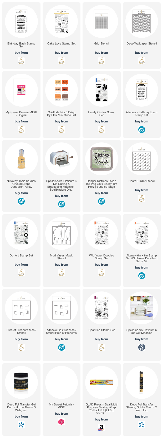
Products used for this set
Some of the links below are affiliate links. If you click through and make a purchase, I receive a small commission, at no extra cost to you. This helps towards maintaining my blog. Thank you for your support.
So, that’s the completed submission – 10 cards, two boxes
and a lot of writing! I can’t tell
you how much it means that you have stuck with me for the past few weeks, and
all I can do now is sit back and wait for my feedback.
I’m off to grab a cuppa and put my feet up. Stay safe and
well, crafty peeps, and, until next time, keep crafting.
Peri x