Showing posts with label MFT Stamps. Show all posts

04 June 2021

AECP 2 - I Can Feel a Rainbow

Hello Crafty Peeps - thank you for popping over to see me. 

Today I have another submission for my AECP Level 2 course and we are still talking about colour. This time instructor Stephanie Klauck demonstrates how to use the colour of your card and the mood associated with it to add to the message you send to the recipient.

In colour psychology, it is thought that each colour can influence mood in various ways, though you might often not be aware of it. In this course, Stephanie uses the following colours and moods to demonstrate this theory:

Blue - calm, tranquility

Red - love, passion energy

Green - growth, nature

Yellow - cheer, optimism

Pink - caring, sensitive, sweet, feminine

Orange - health, happiness, courage

Rainbow - all the above!

I thought it might be interesting to see what the same card made in each of the colours would look like. Some months ago, at the beginning of the UK's first lockdown, I made this card:


It is a large card - 20 cm (8") square - and I think I originally intended to send it to my office, from which I was furloughed for the duration. I didn't send it in the end and it has been in my card store ever since. I came across it whilst looking for something else and it sparked the thought. 

Using the same stamp set, and a selection of stencils, I created the same card in each of the six colours the course covered and found that, indeed, the colour of the components really did affect the feel of the card. I tried to select an appropriate sentiment for each card, too, and I am really pleased with the final set. 


The details for each card are below and there is a full supply list at the end of this post. 

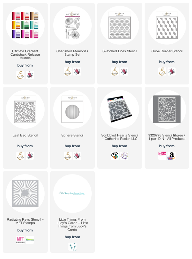
The stamp set is Altenew's 'Cherished Memories' set, which I used to stamp one of each of the flowers onto Altenew Gradient Cardstock. The background papers are from Memory Box's 6" x 6" co-ordinating cardstock pads and the inks for the stencils are Altenew.

I used Copic markers to colour the flowers and leaves - using them on coloured card gives a bit more depth without having to work too hard! 

All the sentiments come from The Stamp Market's 'Modern Messages' and 'More Modern Messages' stamps sets. I love these bold two-part sentiments. 

Blue
The first card I made was the blue one and the choice of stencil (Altenew 'Sphere' stencil) gave me a starting point for the design. In order to replicate the design across all the cards, I cut a circle from a piece of 200gsm vellum, and placed this underneath each stencil that I used in order to contain the pattern to the circle.


Red
For the red card, I used Catherine Pooler's 'Scribbled Hearts' stencil and white ink for the background, and used only the top line of the sentiment, which I embossed with white. 


Green
Nothing says nature like a leaf stencil, so I used Altenew's 'Leaf Bed' stencil for the centre circle on the green card. 


Yellow
For this cheery card, it seemed only fitting to use a ray of sunshine in the centre, and I used MFT's 'Radiating Rays' stencil for this. 


Pink
Because pink is sweet, sensitive and feminine, I thought a string of beads would be appropriate so I used EFCO's 'Stencil Filigree' for the centre. 


Orange
And finally, I used a geometric stencil (Altenew's 'Cube Builder' - two  turns only) for the centre of the orange card. 


Purple
I felt that the rainbow was missing its purple, which isn't included in the class, so I decided to make a purple version for completeness. For this one I chose Altenew's 'Sketched Lines' stencil for the centre circle.


There were, of course, lots of sequins and gems liberally scattered around, though, again, I tried to put these in roughly the same place on each card. And I finished the flower centres with a few drops of Nuvo Crystal 

Here they are together.


To finish, I made a co-ordinating envelope for each card


This was an interesting project and I hope you agree that it does demonstrate that colour can change the look of a card despite using the same elements on it. 

I hope you are all staying well.  Until next time, keep crafting.


Supplies:

Please note that some of the links below are affiliate links and if you follow them and make a purchase I might receive a small commission, at no additional cost to you. This helps to support my blog.

21 May 2021

Another Take on Angie's Girl

 Hello Crafty Peeps and welcome back. Thank you for stopping by.

My last post, in support of Mental Health Awareness Week, used the 'Birthday Girl Sass' digital image from Angie Blom Digital Designs. The hand across the heart of this classic beauty led me to using it as a caring, 'here for you' image, and the finished card was well-appreciated across my social media accounts (thank you!).  In case you didn't see it, here's a reminder:

The same image takes centre stage in today's card, as a 'same but different' comparison. Such a classic beauty would surely be the subject of a portrait painting, don't you think? I thought about the stately homes we had visited, where portraits of the family lined the walls, and so...

Once again, I paper-pieced the dress and coloured her skin and hair with Copic markers. 

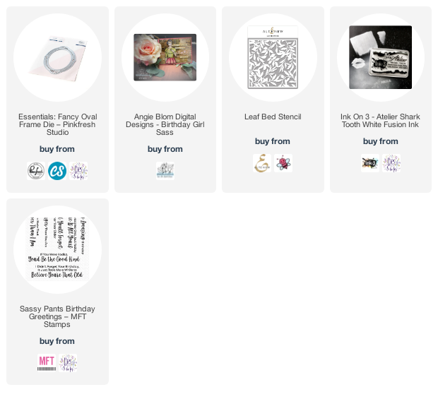
One some green cardstock I used Altenew's 'Leaf Bed' stencil and some Ink On 3 'Shark Tooth White' fusion ink to create a simple background, which picked up the reference to leaves on the dress. I also felt that this gives the impression of a plush wallpaper. (As always, there's a list of the products I used at the end of this post.)

I masked the main image and used an Efco stencil (Filigree) and some blue-grey ink (I'm sorry, I forgot to note which one) to add a background to the image.

The frame is Pink Fresh Studio's 'Essentials Fancy Oval Frame' die, which I cut twice from white card. I used one of the cut frames over the image to work out the best placement and lightly drew inside the oval so that I was able to trim the finished image, just outside the pencil line, to the correct size for the frame.

I drew around the outside of one of the frame die cuts onto some thin grey cardstock and cut this out, just inside the pencil line, before gluing it under one of the white frames. I added these layers on top of the other white frame to give some dimension, before gluing the frame over the oval image. 

I mounted the leaf background onto a 5" x 7" card, which left a 1" strip at the bottom of the card, where I could put my sentiment. I didn't want it to be on top of the card, the way I usually would, because I wanted to retain the idea that the portrait was hanging on top of wallpaper on the wall. 

I couldn't resist adding a cheeky sentiment to bring the card to life, though! This one is from MFT's 'Sassy Pants Birthday Greetings' stamp set - it's a wonderful set for adding a bit of sass to a card.

So that's today's card - I hope you like it. 

 Until next time, keep crafting.


Supplies:

Please note that some of the links below are affiliate links and if you follow them and make a purchase I might receive a small commission, at no additional cost to you. This helps to support my blog. 

02 January 2021

Welcome to 2021!

Hello Crafty Peeps! We made it - it's 2021 and my wish is that you all stay healthy and happy this year. 

I took a break from crafting over the holiday season - I packed all my stuff away (honest, I did - all of it!) and haven't yet made a card this year. However, just before Christmas I made a set of three cards using Altenew's Bold Floral Drape stamp set, which I'll show you today. All the supplies are linked below. 

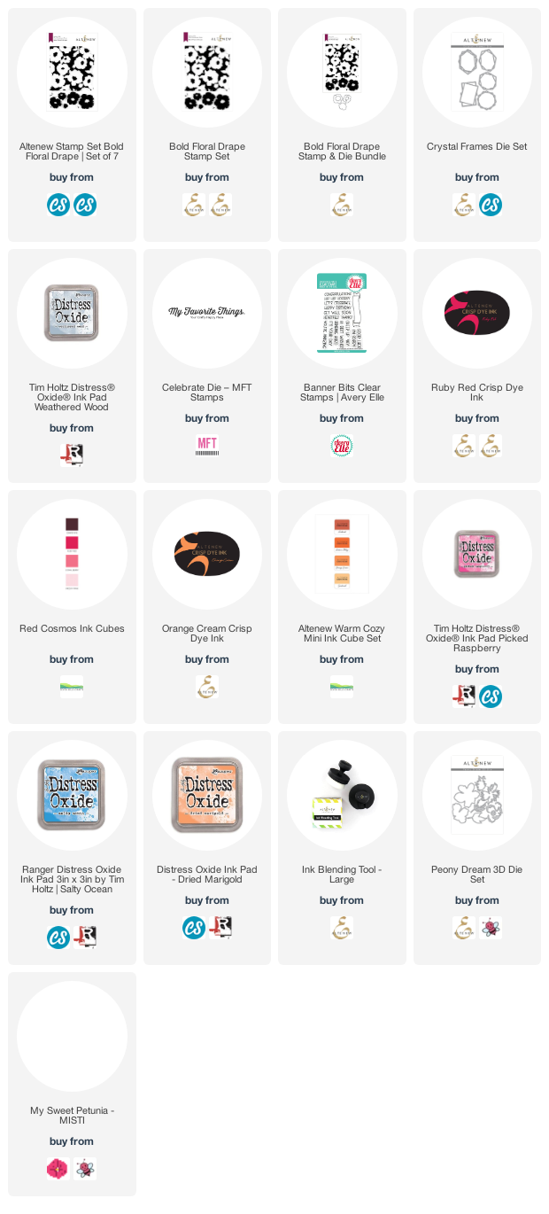
This stamp set is great for backgrounds but also has individual solid flowers that can either be used to fill in the flowers of the background stamp or as separate single flowers. I have to admit that I didn't set out to make the three cards at all. I was stamping the large stamp for the first time and used a neutral grey (Distress Oxide Weathered Wood) just to see the stamped image. I hadn't inked the stamp particularly thoroughly, nor had I conditioned the stamp in any way, so the result was a little patchy and I liked it so much that I repeated it! 

Card One


This is quite a simple card (for me, at least!). The sentiment is one of my own, printed on a laser printer and foiled through a laminator. I shall make more of these, I think - love having foiled greetings to hand.


I chose some gold mirror card to cut a frame from the Altenew Crystal Frames die set and mounted it all onto a grey card base. I like gold and silver together - I like the warmth that the gold gives.


I made an envelope from some matt silver paper and a few clear sequins finished off the card. 

I was inspired by this card to 'ramp up' the design so I made the second card below.

Card Two
For the second card I mounted the background onto grey card, as before, and added some colour by stamping a few of the separate flower images in Altenew Ruby Red and Orange Cream inks. I haven't yet got the co-ordinating die set so I fussy cut the flowers out. 

I rifled through my dies and found this MFT Celebrate die, which I cut from silver card and twice more from red card. I stacked the sentiment die cuts, very slightly offsetting the silver layer so that a touch of the red card could be seen, to pick up the red from the flowers. 


I played around with the layout until I was happy with my placement and then added a few orange sequins from my stash to compliment the orange flowers. 


I was really pleased with this 'amped up' version. You could use all sorts of colours for the separate flowers, and you could make the background more or less vibrant...which leads me to the final card.

Card Three
I wondered what the background would look like stamped in a really vibrant colour, with the separate flower stamps used to fill in the white spaces. I also wondered whether the background stamp would lend itself to being extended, to fill a slimline card, for example. So, with the help of my trusty MISTI, a bit of jiggling around and practice stamping, I managed to get the result I was looking for:


This stamp set is not a neat and tidy set - its charm is in its fluid design - so the flowers don't completely match the empty spaces. I used Distress Oxide Salty Ocean for the bold blue background layer, and Dried Marigold and Picked Raspberry for the beautiful accent flowers. I chose card from my stash to cut the Peony Dream 3D flowers, which I love, and stacked these towards the top third of my card. 


The foiled sentiment is another of my own.


I made a matching envelope and, just for a little extra, I added a scrap from the patterned piece to the front of it. 


And here they are together, simple, amped up and WOW! It just goes to show, though, what you can achieve with the same stamp set, and I'm delighted with the results. 

So, until next time, my crafty friends, stay safe, stay well and keep crafting. 

Peri x

Supplies:
Some of the links below are affiliate links. If you click through and make a purchase, I receive a small commission, at no extra cost to you. This helps towards maintaining my blog. Thank you for your support.

04 October 2020

Have 'Yourselfie' a Very Happy Birthday

Morning, crafty peeps - I hope you're having a great weekend. Thought I'd just pop in with a quick post and a fun card.

There's a well-known fact in the crafting world that it is always a challenge to create cards for men. This is not because they're a fussy bunch, but simply that there are far fewer products on the market to inspire us. However, I recently picked up the Picture Perfect Party Animals stamp set from MFT Stamps and this set is perfect for cards for boys and men of all ages. I love the humour of these stamps. 


I chose the partying parrots stamp for this project, and coloured it with a ton of Copic markers, listed below. I wanted a background of tropical leaves so I chose  the Newton's Nook Tropical Leaves stencil and used several Altenew inks to create a layered background. I inked the stencil once with a variety of green inks, then moved the stencil and inked again, making sure to vary the inks I used so that I got some depth. Once I'd done that I decided that the white space left by the stencil was too stark, so I took another light green ink and simply inked over the whole piece, using a blending brush to achieve a smooth finish. This gave me exactly the result I was hoping for.


The sentiment is from the same stamp set and I stamped it with Memento Tuxedo Black ink. If I were to make this card again, I would probably stamp the sentiment at the bottom of the Polaroid frame, rather than on the background, but, hey, there's always a learning opportunity! 


I used the MFT Polaroid Shaker Frame Die-namics die to create a frame for the image, and then popped that up on the card with some 3D foam squares. 

Finally, I created a coordinating envelope from some free papers I had received with a craft magazine.

Copics used:
B00, B12, B14, B16, B24, B26
BG11, BG13, BG15, BG18, BG45
V15, V17, V25
YR07, YR16
YG01, YG17, YG23, YG25

Altenew inks (background):
Parrot, Olive, Shadow Creek
Frayed Leaf

Thank you for your time and I hope you've enjoyed reading.
'Til next time, happy crafting! 

Peri x