
Showing posts with label recycling. Show all posts

12 September 2021

AECP 2 - Final Challenge Part 2

Hi Crafty Peeps - welcome to Part 2 of my AECP Level 2 Final Challenge post. You can read Part 1 here. 

As a reminder, the first part of the final challenge was to create four masculine cards for various occasions throughout the year and this is the second part - to repurpose/recycle or alter.

Upcycled/Repurposed Item

Our house is full of potential repurposing things and I often repurpose boxes into pretty gift boxes, particularly at Christmas as it is always wonderful to give and receive a beautifully presented gift, don’t you think? But I chose to recycle the case of an old, much-loved but damaged CD.

This is a desk calendar – ‘A Year of Flowers’ – and it sits in the CD case beautifully.

My first challenge was to set up the pages so that I could print the calendar month and a motivational/ thoughtful/funny quotation on each page. I use MS Publisher when need to lay out a page accurately – I find it works better than Word. 

I measured the inside of the CD lid, which came to 12 cm x 14 cm, so I wanted my pages to be 11.8 cm x 13.8 cm, so that I had a little wriggle room when sliding them in and out of the lid. In order not to waste paper, I set up two calendar pages on one sheet of paper and made sure that I was consistent with placement, headings, fonts, etc., throughout. 

You can see how the pages were set out in this screenshot.

Once I was happy I printed the pages onto Make It Colour card – it is so smooth and I love how it takes ink and markers and pencils.

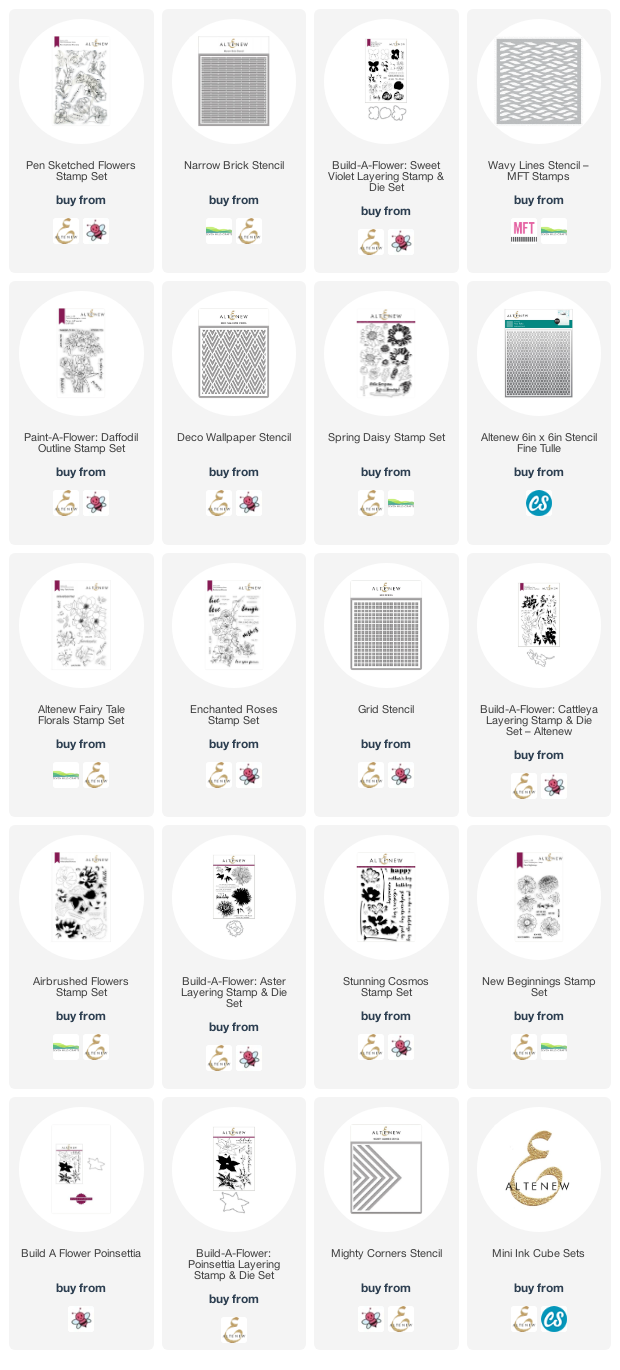
In order to deliver a year of flowers, Mr Google and I worked at finding a list of birth month flowers and came up with the following (plus a note of the stamp sets and stencils used for each page):

January - carnation and snowdrop (Pen Sketched Flowers and Narrow Brick Stencil)
February - violet and primrose (Build-a-Flower: Sweet Violet and MFT Wavy Lines Stencil)
March - daffodils and jonquils (Paint-a-Flower: Daffodil and Deco Wallpaper Stencil)
April - daisy and sweet pea (Spring Daisy and Fine Tulle Stencil)
May - lily of the valley and hawthorn (Fairy Tale Florals and Fine Tulle Stencil)
June - rose and honeysuckle (Enchanted Roses and Grid Stencil)
July - larkspur and waterlily (Build-a-Flower: Cattleya and Fine Tulle Stencil)
August - gladiolus and poppy (Airbrushed Flowers and Deco Wallpaper Stencil)
September - aster and morning glory (Build-a-Flower: Aster and Grid Stencil)
October - marigold and cosmos (Stunning Cosmos and Narrow Brick Stencil)
November - chrystanthemum (New Beginnings and Narrow Brick Stencil)
December - narcissus and holly (Build-a-Flower: Poinsettia and Mighty Corners Stencil)

I had some of these flower stamps already and some that could masquerade as others, so I pulled them all out of my stash and got to work. December didn't get her holly, tho!

I also chose several of my stencils, as I knew I would need them for background interest. I tried to choose quite geometric patterns as a foil to the softness and prettiness of the flowers, as I didn’t want the pages to look too fussy. I also pulled out my roll of Judikins masking paper, as I could tell there was lots of masking ahead! And I think this shows my dedication to fussy cutting!

I cut an oblong mask to mask the calendar part of the page, as I didn’t want any colour over this. Then I stamped around the page, masking where necessary, and masking everything before stencilling the background. 

Once done, I added colour to the flowers in a combination of layers of the layering stamp, Copic markers and coloured pencils.

There’s a little photo-story below of making one of the pages, so that you can see my process:

  • mask the month
  • stamp and mask the flowers
  • stencil over masked page
  • remove stencil and all masks to reveal finished page.

Tip:

Even if you are using a layering stamp set, you can add extra depth and detail with your favourite colouring medium. I used Prismacolor pencils over some of my final images to strengthen the shadows or deepen a colour I felt was a little too light. You can see the difference this has made in the Sweet Violet images - check the page above then see the page below, where I have used coloured pencils to add further depth and colour to the stamped image.

And here are the final calendar pages.


As you can see, the calendar sits really well on its own and as each month passes the front card moves to the back and a new month is revealed. 


Thank you for your time in reading this long post. I hope you have found it interesting and that you might even have a go at repurposing a CD case yourelf.

As always, a list of all the products I have used (where still available) is below.

 Until next time, keep crafting.


Supplies:

Please note that some of the links below are affiliate links and if you follow them and make a purchase I might receive a small commission, at no additional cost to you. This helps to support my blog. 
14 December 2020

AECP 1 - Final Project Submission

 Hi Crafty Peeps, I hope you are all staying well. Thank you for taking time to stop by today.

Well, it’s here, my AECP Level 1 final project! After taking the first 10 classes, I must complete a cardmaking challenge to demonstrate what I have learned along the way. My challenge was to make a set of gender-specific cards, plus packaging, to give as a gift. Additionally, I had to include a recycled element in the final product.

Needless to say, this blog post is going to be really, really long (almost a book!) so I have split it into three separate posts: this one, and one for each set of cards. The preamble will be in this post, so grab a drink, maybe a biscuit (cookie) or two, and settle in for a read.

THE CLASSES

I thought long and hard about which of the classes to focus on, as there were interesting techniques in each lesson, and inspiration for all sorts of directions to explore, but I finally chose:

Celebration Stencil Techniques

This was a great class, led by Laurel Beard. In Lesson 1 she encouraged students to create their own stencils with die cuts, which I love doing, and you can see this in both of my geometric cards where I cut triangles and circles to use alongside the stamp sets.

Lesson 4 is all about using a stencil to add further interest on top of an ink blended/painted background. I stretched this further and used a stencil over another stencilled background – you can see this in both of the grid-stencilled cards, where I have used another stencil to apply transfer gel and foiled details over the top of the stencilled background. Just in case it isn’t obvious, I love stencils!

Clean and Simple Boutique Cards

I chose this class, led by Jennifer Rzasa, because I’m not very good at ‘clean and simple’ and thought it would extend the challenge for me to produce at least a couple of cards in this style - see whether you think I hit the right style with the masculine ‘Friend’ card and the feminine vase card.

Lesson 3 - Foiling/Metallic Details – was the inspiration for adding foiled elements to some of my cards, a new technique for me.

Lesson 2 – Stamped Backgrounds – inspired me to use stamps to create my own paper to wrap the lids of the boxes I made for packaging.

Seasonal Scene Building

In this class Nichol Magouirk offered lots of tips about layout and building layered scenes. I took inspiration from both Lesson 4 - Framed Scene, and Lesson 5 - Window Scene and applied this to cards in both sets.

I think every class that formed part of my Level 1 experience offered inspiration, whether by refreshing those skills I already had, or encouraging me to use new techniques. In particular, I took inspiration from the following classes:

For the Guys

I love Geometrics (Lesson 1) so was able to incorporate these in both sets, and Interactive (Lesson 4) gave me the inspiration for my fridge magnet cards.

Let It Shine

Who doesn’t love a bit of bling? This class with Carissa Wiley confirmed that there is rarely an occasion where you can’t introduce a little something shiny. Her use of embellishments (Lesson 3), metallic cardstock (Lesson 5) and foil (Lesson 6) taught me not to be afraid of getting my shine on!

Layering 1 and 2

These two classes were obvious inclusions. There aren’t any particular lessons I would refer to, but the general instruction and techniques for layering the stamped images are so helpful. I even found the general principles useful when I came to ink up the layered stencils on my cards, having become more confident with placement and accuracy, etc.

THE CHALLENGE

The challenge was to create two sets of cards, gender specific, and package them for gifting. Each set had to be cohesive and creative, and, of course, the cards must showcase Altenew products.

I wanted the two sets of cards to have something in common, and I also wanted each set to have its own common theme. I decided that I would use a stencil on every card, and that the sets would each have their own consistent colour scheme. Where possible, I would ‘mirror’ the stencil and produce a masculine/feminine version of the card (and I achieved this on three cards). I decided not to use the usual gendered colour schemes of blue and pink and instead chose a coffee palette (Sand Dunes and Rocky Shore inks) for the masculine cards and a fresh green palette (Firefly and Lime) for the feminine cards. 

I also made the decision to produce square cards, a format which I love but which not many of my American friends seem to use. Here in the UK square cards are easy to get hold of, but I tend to make my own card bases (300gsm/140lb cardstock) and envelopes for ‘special’ cards. The cards in both sets are 14.5cm (512/16”) square.

I will list the products used at the bottom of each post. In the following descriptions, all products are from Altenew unless otherwise identified.

To see how I made each set, please follow the links below:

Masculine Cards       FeminineCards