Hello Crafty Peeps - thank you for popping over to see me.
Today I have another submission for my AECP Level 2 course and we are still talking about colour. This time instructor Stephanie Klauck demonstrates how to use the colour of your card and the mood associated with it to add to the message you send to the recipient.
In colour psychology, it is thought that each colour can influence mood in various ways, though you might often not be aware of it. In this course, Stephanie uses the following colours and moods to demonstrate this theory:
Blue - calm, tranquility
Red - love, passion energy
Green - growth, nature
Yellow - cheer, optimism
Pink - caring, sensitive, sweet, feminine
Orange - health, happiness, courage
Rainbow - all the above!
I thought it might be interesting to see what the same card made in each of the colours would look like. Some months ago, at the beginning of the UK's first lockdown, I made this card:
It is a large card - 20 cm (8") square - and I think I originally intended to send it to my office, from which I was furloughed for the duration. I didn't send it in the end and it has been in my card store ever since. I came across it whilst looking for something else and it sparked the thought.
Using the same stamp set, and a selection of stencils, I created the same card in each of the six colours the course covered and found that, indeed, the colour of the components really did affect the feel of the card. I tried to select an appropriate sentiment for each card, too, and I am really pleased with the final set.
The details for each card are below and there is a full supply list at the end of this post.
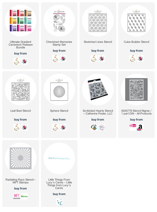
The stamp set is Altenew's 'Cherished Memories' set, which I used to stamp one of each of the flowers onto Altenew Gradient Cardstock. The background papers are from Memory Box's 6" x 6" co-ordinating cardstock pads and the inks for the stencils are Altenew.
I used Copic markers to colour the flowers and leaves - using them on coloured card gives a bit more depth without having to work too hard!
All the sentiments come from The Stamp Market's 'Modern Messages' and 'More Modern Messages' stamps sets. I love these bold two-part sentiments.
Blue
The first card I made was the blue one and the choice of stencil (Altenew 'Sphere' stencil) gave me a starting point for the design. In order to replicate the design across all the cards, I cut a circle from a piece of 200gsm vellum, and placed this underneath each stencil that I used in order to contain the pattern to the circle.
Red
For the red card, I used Catherine Pooler's 'Scribbled Hearts' stencil and white ink for the background, and used only the top line of the sentiment, which I embossed with white.
Green
Nothing says nature like a leaf stencil, so I used Altenew's 'Leaf Bed' stencil for the centre circle on the green card.
Yellow
For this cheery card, it seemed only fitting to use a ray of sunshine in the centre, and I used MFT's 'Radiating Rays' stencil for this.
Pink
Because pink is sweet, sensitive and feminine, I thought a string of beads would be appropriate so I used EFCO's 'Stencil Filigree' for the centre.
Orange
And finally, I used a geometric stencil (Altenew's 'Cube Builder' - two turns only) for the centre of the orange card.
Purple
I felt that the rainbow was missing its purple, which isn't included in the class, so I decided to make a purple version for completeness. For this one I chose Altenew's 'Sketched Lines' stencil for the centre circle.
There were, of course, lots of sequins and gems liberally scattered around, though, again, I tried to put these in roughly the same place on each card. And I finished the flower centres with a few drops of Nuvo Crystal
Here they are together.
To finish, I made a co-ordinating envelope for each card
This was an interesting project and I hope you agree that it does demonstrate that colour can change the look of a card despite using the same elements on it.
I hope you are all staying well. Until next time, keep crafting.
Supplies:
Please note that some of the links below are affiliate links and if you follow them and make a purchase I might receive a small commission, at no additional cost to you. This helps to support my blog.


Perfect tribute to PRIDE month Peri and, as usual, gorgeous cards too. Amazing how you can change the whole feel of a card just with colour!
ReplyDeleteOMG you used all the colours! WOW. All cards look amazing, Peri! Hats off to you for creating so many cards! Thank you for submitting your wonderful work to the AECP assignment gallery.
ReplyDeleteThank you, Erum - it was a fun project!
DeleteAll the contents you mentioned in post is too good and can be very useful. I will keep it in mind, thanks for sharing the information keep updating, looking forward for more posts.Thanks Rainbow Pride
ReplyDeleteHi, I'm sorry it's taken me so long to acknowledge your kind comment - I hadn't realised you'd posted. Thank you - I'm so pleased you are finding some inspiration in my posts. Keep your eyes peeled for my big post on the 11/12 September - I think you'll enjoy it. x
Delete