13 June 2021

Sunshine at last!

Hello Crafty Peeps, and welcome back to my blog. 

Here in the UK we have some much-needed sunshine and warmth, and it coincides with some relaxing of the covid restrictions, which is lovely. 

Sunshine means summer fun and this card came together so easily while I was looking at the beautiful blue sky. 


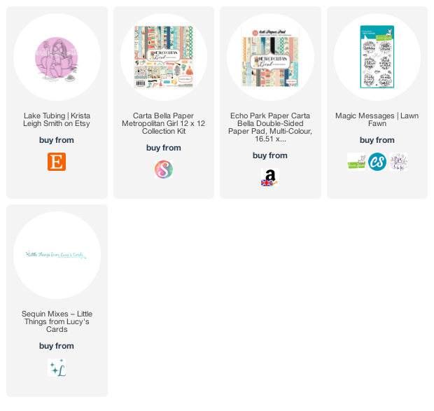
This is a digital stamp from Krista Smith on Etsy (full details below, along with supplies list). The designer paper in the background was in my 'scrap stash', but a little rifling through my paper pads found it was originally from Carta Bella's  'Metropolitan Girl' 6" x 6" paper pad. Unfortunately, it seems that this small pad is no longer produced and it is difficult, though not impossible, to find one online. You can, however, still buy the 12" x 12" collection.

I wanted to create something for the fun of creating something - I find that much of my crafty time is spent making cards for specific people and occasions, or for my AECP classes, and it is sometimes just fun to make something different.


I used Copic markers to colour the focal image and created a matching bokeh effect by using the colourless blender marker to remove some of the colour from the blue. 

The sentiment reflects exactly the feel I wanted for this card - fun, sunny and bright. It's from Lawn Fawn (details below) and I love it.

There are, as always, sequins and gems for sparkle. 


I hope you're enjoying some sunshine wherever you are.  Until next time, keep crafting.


Supplies:

Please note that some of the links below are affiliate links and if you follow them and make a purchase I might receive a small commission, at no additional cost to you. This helps to support my blog. 

04 June 2021

AECP 2 - I Can Feel a Rainbow

Hello Crafty Peeps - thank you for popping over to see me. 

Today I have another submission for my AECP Level 2 course and we are still talking about colour. This time instructor Stephanie Klauck demonstrates how to use the colour of your card and the mood associated with it to add to the message you send to the recipient.

In colour psychology, it is thought that each colour can influence mood in various ways, though you might often not be aware of it. In this course, Stephanie uses the following colours and moods to demonstrate this theory:

Blue - calm, tranquility

Red - love, passion energy

Green - growth, nature

Yellow - cheer, optimism

Pink - caring, sensitive, sweet, feminine

Orange - health, happiness, courage

Rainbow - all the above!

I thought it might be interesting to see what the same card made in each of the colours would look like. Some months ago, at the beginning of the UK's first lockdown, I made this card:


It is a large card - 20 cm (8") square - and I think I originally intended to send it to my office, from which I was furloughed for the duration. I didn't send it in the end and it has been in my card store ever since. I came across it whilst looking for something else and it sparked the thought. 

Using the same stamp set, and a selection of stencils, I created the same card in each of the six colours the course covered and found that, indeed, the colour of the components really did affect the feel of the card. I tried to select an appropriate sentiment for each card, too, and I am really pleased with the final set. 


The details for each card are below and there is a full supply list at the end of this post. 

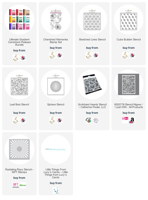
The stamp set is Altenew's 'Cherished Memories' set, which I used to stamp one of each of the flowers onto Altenew Gradient Cardstock. The background papers are from Memory Box's 6" x 6" co-ordinating cardstock pads and the inks for the stencils are Altenew.

I used Copic markers to colour the flowers and leaves - using them on coloured card gives a bit more depth without having to work too hard! 

All the sentiments come from The Stamp Market's 'Modern Messages' and 'More Modern Messages' stamps sets. I love these bold two-part sentiments. 

Blue
The first card I made was the blue one and the choice of stencil (Altenew 'Sphere' stencil) gave me a starting point for the design. In order to replicate the design across all the cards, I cut a circle from a piece of 200gsm vellum, and placed this underneath each stencil that I used in order to contain the pattern to the circle.


Red
For the red card, I used Catherine Pooler's 'Scribbled Hearts' stencil and white ink for the background, and used only the top line of the sentiment, which I embossed with white. 


Green
Nothing says nature like a leaf stencil, so I used Altenew's 'Leaf Bed' stencil for the centre circle on the green card. 


Yellow
For this cheery card, it seemed only fitting to use a ray of sunshine in the centre, and I used MFT's 'Radiating Rays' stencil for this. 


Pink
Because pink is sweet, sensitive and feminine, I thought a string of beads would be appropriate so I used EFCO's 'Stencil Filigree' for the centre. 


Orange
And finally, I used a geometric stencil (Altenew's 'Cube Builder' - two  turns only) for the centre of the orange card. 


Purple
I felt that the rainbow was missing its purple, which isn't included in the class, so I decided to make a purple version for completeness. For this one I chose Altenew's 'Sketched Lines' stencil for the centre circle.


There were, of course, lots of sequins and gems liberally scattered around, though, again, I tried to put these in roughly the same place on each card. And I finished the flower centres with a few drops of Nuvo Crystal 

Here they are together.


To finish, I made a co-ordinating envelope for each card


This was an interesting project and I hope you agree that it does demonstrate that colour can change the look of a card despite using the same elements on it. 

I hope you are all staying well.  Until next time, keep crafting.


Supplies:

Please note that some of the links below are affiliate links and if you follow them and make a purchase I might receive a small commission, at no additional cost to you. This helps to support my blog.

24 May 2021

AECP 2 - Colour My Day

Hello Crafty Peeps, lovely to see you again. 

Today I''m on the AECP trail, with my submission for the class 'Color My Day', led by the very talented Therese Calvird, one of my favourite cardmakers. In this class Therese demonstrates how to choose and combine colours to give some interest to your cards and I have chosen to base my submission on lesson 2, 'Color Wheel'. 

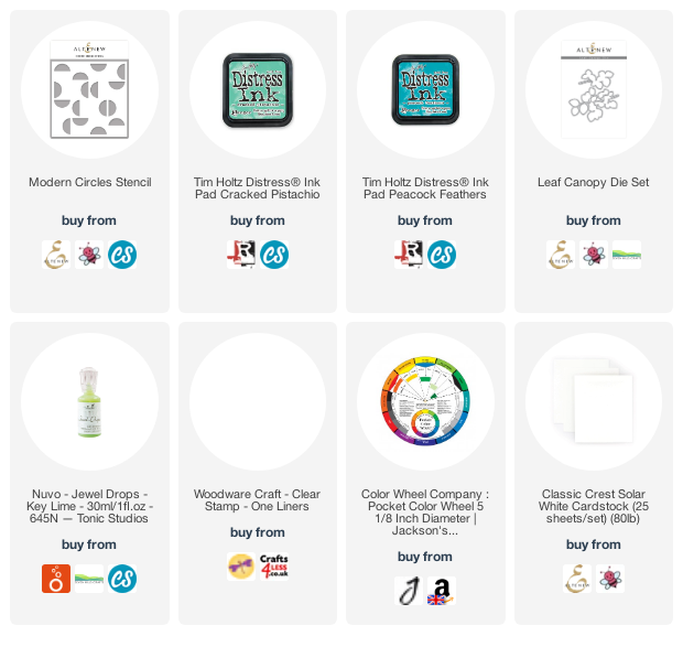
I love colour and am not shy about using bold, bright and even clashing colours together on a card. But sometimes it pays to refresh some colour theory and so a colour wheel really comes in useful. They are readily available at most artist's supplies shops, but I bought mine from Amazon (link below). I particularly like the one I have as it is annotated with full instructions about using it, so there's no need for separate notes.

For my card, I wanted to use analogous colours, which are colours adjacent to each other on the wheel. I turned the wheel so that the arrow pointed to blue-green and chose yellow-green as my second colour.  This has to be one of my favourite combinations and one that I use often in my cardmaking. 

Here is the card I came up with, bold and bright and gender neutral. I used Altenew's Modern Circles stencil, which I inked with Cracked Pistachio and Peacock Feathers Distress Inks, on a 15cm (6") square of Nina Classic Crest Solar White 110lb paper. The resulting pattern is very simple but very effective. To complement it, I cut a circle from the square and then used two circle nesting dies to cut a frame for the opening. 

I lined up the square over the top of a 15cm square card base and drew a faint pencil line on the inside of the circle. Having removed the square I then lightly drew a freehand circle about 0.5cm (1/4") outside the one I had marked and then erased the inner line. I used Altenew Limeade ink to colour the card blank inside the pencilled line, swiping the cube straight to the cardstock.

I cut some fun foam to just smaller than a 15cm square and marked the position of the circle, which I cut away. I used the fun foam to give dimension when mounting the square onto the card base.

Using  Altenew's Leaf Canopy die set, I cut two sprigs of leaves from two shades of blue/blue-green mirror card and mounted these on the left of the circle, allowing them to overhang a little to cast a shadow on the background.

The sentiment is from Woodware's One Liners stamp set - a label style stamp set - which I stamped with black ink on white cardstock and added across the aperture. 

Rather than add sequins or gems, I used some Key Lime Nuvo Jewel Drops to add a little extra shine. To finish, I made a matching envelope and scored the flap for a little texture. 

My next AECP post will also deal with colour, its effect on mood and how that can be used to advantage in your cardmaking - it's fascinating.

 Until next time, keep crafting.


Supplies:

Please note that some of the links below are affiliate links and if you follow them and make a purchase I might receive a small commission, at no additional cost to you. This helps to support my blog. 

21 May 2021

Another Take on Angie's Girl

 Hello Crafty Peeps and welcome back. Thank you for stopping by.

My last post, in support of Mental Health Awareness Week, used the 'Birthday Girl Sass' digital image from Angie Blom Digital Designs. The hand across the heart of this classic beauty led me to using it as a caring, 'here for you' image, and the finished card was well-appreciated across my social media accounts (thank you!).  In case you didn't see it, here's a reminder:

The same image takes centre stage in today's card, as a 'same but different' comparison. Such a classic beauty would surely be the subject of a portrait painting, don't you think? I thought about the stately homes we had visited, where portraits of the family lined the walls, and so...

Once again, I paper-pieced the dress and coloured her skin and hair with Copic markers. 

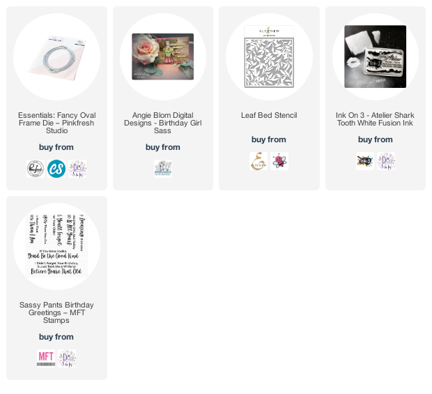
One some green cardstock I used Altenew's 'Leaf Bed' stencil and some Ink On 3 'Shark Tooth White' fusion ink to create a simple background, which picked up the reference to leaves on the dress. I also felt that this gives the impression of a plush wallpaper. (As always, there's a list of the products I used at the end of this post.)

I masked the main image and used an Efco stencil (Filigree) and some blue-grey ink (I'm sorry, I forgot to note which one) to add a background to the image.

The frame is Pink Fresh Studio's 'Essentials Fancy Oval Frame' die, which I cut twice from white card. I used one of the cut frames over the image to work out the best placement and lightly drew inside the oval so that I was able to trim the finished image, just outside the pencil line, to the correct size for the frame.

I drew around the outside of one of the frame die cuts onto some thin grey cardstock and cut this out, just inside the pencil line, before gluing it under one of the white frames. I added these layers on top of the other white frame to give some dimension, before gluing the frame over the oval image. 

I mounted the leaf background onto a 5" x 7" card, which left a 1" strip at the bottom of the card, where I could put my sentiment. I didn't want it to be on top of the card, the way I usually would, because I wanted to retain the idea that the portrait was hanging on top of wallpaper on the wall. 

I couldn't resist adding a cheeky sentiment to bring the card to life, though! This one is from MFT's 'Sassy Pants Birthday Greetings' stamp set - it's a wonderful set for adding a bit of sass to a card.

So that's today's card - I hope you like it. 

 Until next time, keep crafting.


Supplies:

Please note that some of the links below are affiliate links and if you follow them and make a purchase I might receive a small commission, at no additional cost to you. This helps to support my blog.