15 July 2022

Getting all Zentangled!

Hello Crafty Peeps, and thank you for stopping by. 

This last few weeks have been hectic and I've only now found time to post my next project towards my AECP Level 3, after taking Amber Davis's 'Zentangle for Cardmakers' class. I would encourage you to have a look at Amber's class, as she perfectly demonstrates how Zentangle can really bring some additional interest to your card making.

Now, I'm not a patient person and I found this class quite a challenge because it is the repetitive practice of Zentangle which brings results rather than the immediacy of, say, using stencils or stamps to achieve the end goal. But, in the end, I did manage to find my zen and produce two cards, which, whilst they do not directly use the patterns that Amber demonstrated in her class, are recognised tangles (Cadent and Crazy 'NZeppel).

Card One

This first card is my take on the Crazy 'NZeppel pattern, which I applied to a die cut ampersand.


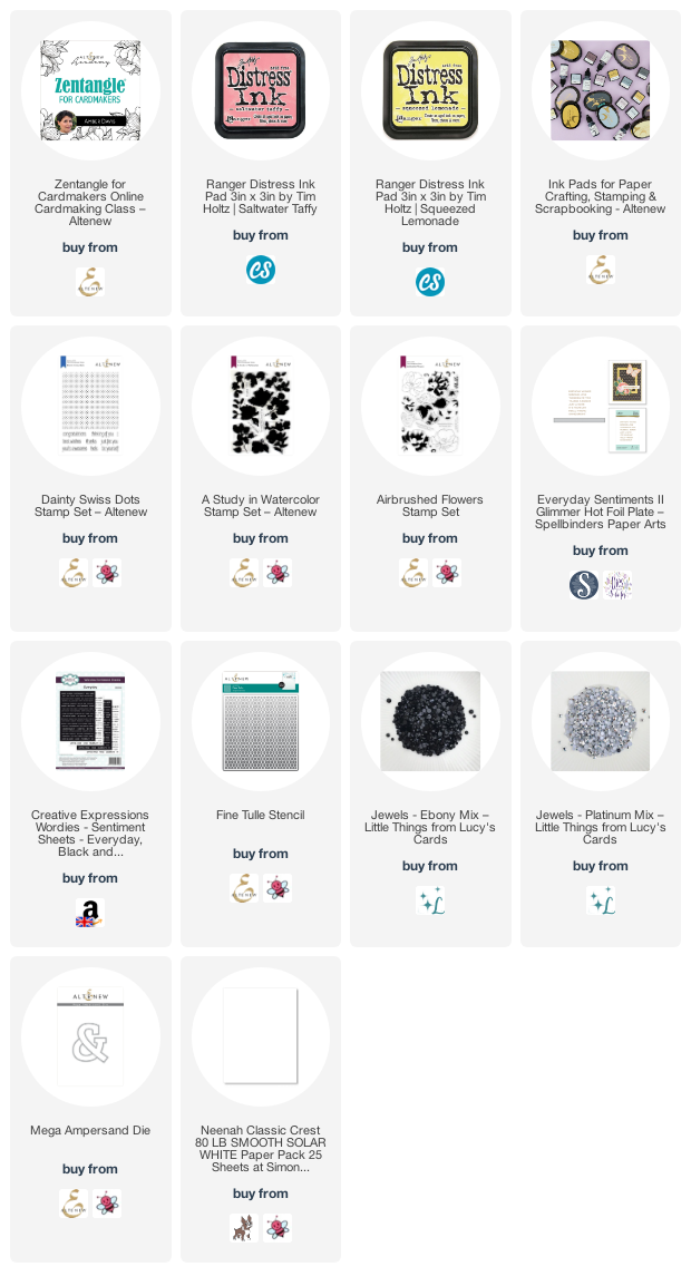
I created a background using stamps from Altenew's 'A Study in Watercolor' set, and stamping with Saltwater Taffy Distress Ink to fill the card front panel (Neenah 80lb Classic Crest). I then took the 'Fine Tulle Stencil' and using only the ink left on my yellow blending brush, I lightly applied some ink through random areas of the stencil. That done, I used my Altenew Jet Black ink cube and popped some ink onto an acrylic block, sprayed it with some water, and used a small brush to flick some splatter over the background. 


Then I turned my attention to the die cut. I chose to use the Crazy variation of the Nzeppel pattern to cover the ampersand in rounded 'tiles', using a dark grey Copic marker to fill in the background and a range of pinks, working inwards from dark to light, to colour each tile. Traditionally, Zentangle is produced only in black and white with shades of grey, but I love the idea of colour, as you will know by now. 


I cut a couple of extra ampersands so that I could layer these under the decorated one, to give a little dimension. To ensure there were no bright white edges to the finished stack, I coloured the edge with a black pen, which also gives a little more definition to the stack.

I have recently purchased some Wordies Sentiment Strips from Creative Expressions and I thought I would try these out on this card. They come in white with black lettering and black with white lettering, which are the ones I chose here. The sheets are easily cut and, again, to ensure the white cut line wasn't visible, I edged each of the cut words with black pen.


To finish, I affixed all the elements of the card and popped on some beautiful black gems for a final flourish, and made a co-ordinating envelope.

Card Two

I wasn't having much success with some of the patterns Amber demonstrated in these lessons, which is no reflection on Amber, who is super talented and a very good teacher. I'm not sure what the barrier was - I suspect my shaky hand and hay-fever eyes contributed to my less than successful attempts - and I was disappointed not to be able to do more justice to this brilliant class. I decided to look up some other tangles and came across 'Cadent', which, through simple lines, created an almost basket weave effect, and could be shaded for more dimension. 


To help with placement, I had the idea to stamp the 'Dainty Swiss Dots' background stamp in a pale grey, and used this grid of dots as a guide to create the pattern. 
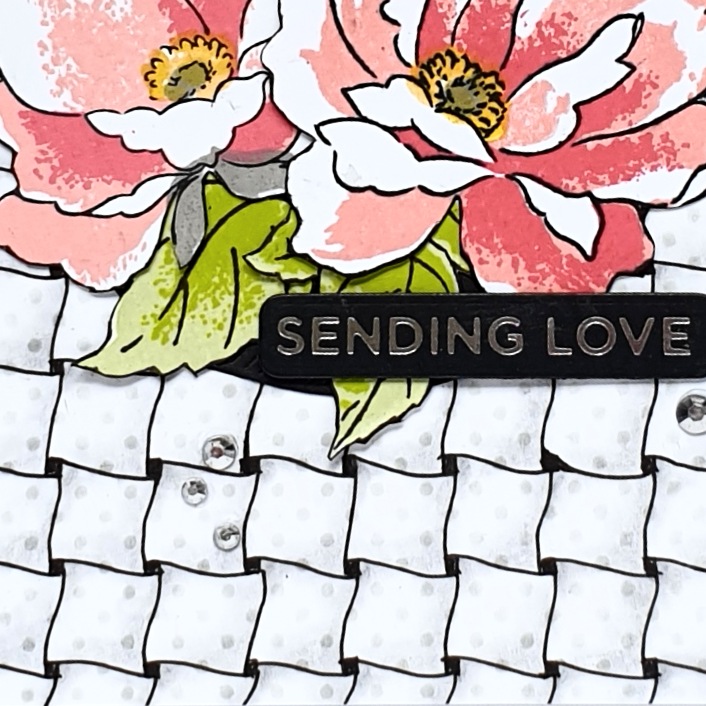

Having successfully completed the whole card front with this tangle, I added a little shading in graphite pencil and trimmed the panel to 4" x 5 1/4" before adding it to a 4 1/4 " x 5 1/2" top folding card. 
 
To contrast with the quite regimented background and to bring some femininity to the finished card, I chose to stamp with the 'Airbrushed Flowers' stamp set, using a selection of Distress Inks and Altenew Crisp Dye Inks in pinks and greens. I fussy cut the stamped images and arranged them on the card front, but realised they needed a little something to 'ground' them on the card, so I cut a circle out of black cardstock to place underneath the cluster of flowers and this was just the addition it needed. 


I added some platinum crystals from Lucy's Cards for a little sparkle, and a foiled sentiment finished the card off. There was, of course, a co-ordinating envelope.

Despite my lack of patience, my shaky hands and blurry vision, I am happy with these two cards. 

Until next time, keep crafting.


Supplies:

Please note that some of the links below are affiliate links and if you follow them and make a purchase I might receive a small commission, at no additional cost to you. This helps to support my blog. 
22 June 2022

Just Tattoo of Us!

 Hi there, Crafty Peeps, and thank you for stopping by. 

First, a little apology - the blog gremlins have visited and I have no idea what they've done to my header, so it all looks a little strange at the moment. I'll work on it over the next few days.

I've been having a fine old time this week with Jaycee Gaspar's class 'Transcending Tattoo Techniques'. Jaycee is not only a very talented artist and cardmaker, but he is a great teacher. His instructions are always clear and his demonstrations are a pleasure to watch. In this class, over 6 lessons, Jaycee introduces us to the idea of using tattoo techniques in our cardmaking and it's a wonderful concept! I have always been fascinated by tattoo art (though I'm not brave enough to actually have a tattoo) - there are so many styles, each with its own very particular look, and Jaycee explores 6 of these in this class. 

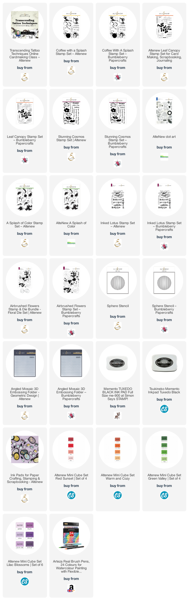
As always, all the products I have used are listed at the end of this post.

Card One

I was most taken with the 'Trash Polka' style, which is done only in red and black ink and results in an almost mixed-media look. I Googled lots of examples and decided that I would use the Inked Lotus as my focal flower, which I coloured with Arteza Brush Pens for a change.  Here's the finished card:


I used the Sphere Stencil and some Memento Tuxedo Black ink to lightly ink the centre background - I blended this black very softly so as to provide some dynamic between the absolute black of the stems and splatters and the background. I used various splatters, dots and rings from the Coffee With A Splash, Dot Art, and A Splash of Color stamp sets, using both black and red inks. 


I stamped onto a light kraft card (as did Jaycee for this style), as this style lends itself to using a coloured background. I felt it might be a little too stark a contrast to ink on white cardstock 

I splattered with white gouache and black ink and used some Nuvo Crystals in Black for a little deep, dark shine. 


The sentiment is from the Inked Lotus stamp set, stamped onto a piece of pale beige card and with a doodled border. I didn't want to mat the card front before adding it to my card base, but felt that it needed something to finish off the panel, so I simply swiped my Obsidian ink pad around the edges of the panel and this gave me just the definition I was looking for. I mounted the lotus flower on to craft foam for dimension and to make sure that there wasn't any white showing underneath, I coloured the cut edges of the foam with a black brush pen.

It had to have a black envelope, didn't it? I'll just have to use a white pen for the address.

Cards Two, Three, Four and Five

It's fair to say that I was really inspired by Jaycee's class, and by all the wonderful tattoo art examples I saw on Google and Pinterest. This next set of cards takes influences from all sorts of styles and I just love them:


These cards all use the Airbrushed Flowers stamp and die set, with additions from my stash for the geometric and clock dies. I also used the Angled Mosaic 3D Embossing Folder, which gives some beautiful texture, and an old stamp from my stash to create the background on the 4th card.

These were very simple cards to make as everything was done for me - layering flower stamps, die cuts and embossing folder - and yet they look quite opulent IRL. 

Here's a closer look at each card:


Card Six

Whilst looking through various images of tattoo styles, I came across Destrutturato style ('deconstructed'), a modern style, invented in 2016 by Mattia Mambo. The tattoos have a 'boiled down pop art aesthetic' and use bright colours and offset designs, as the example below:


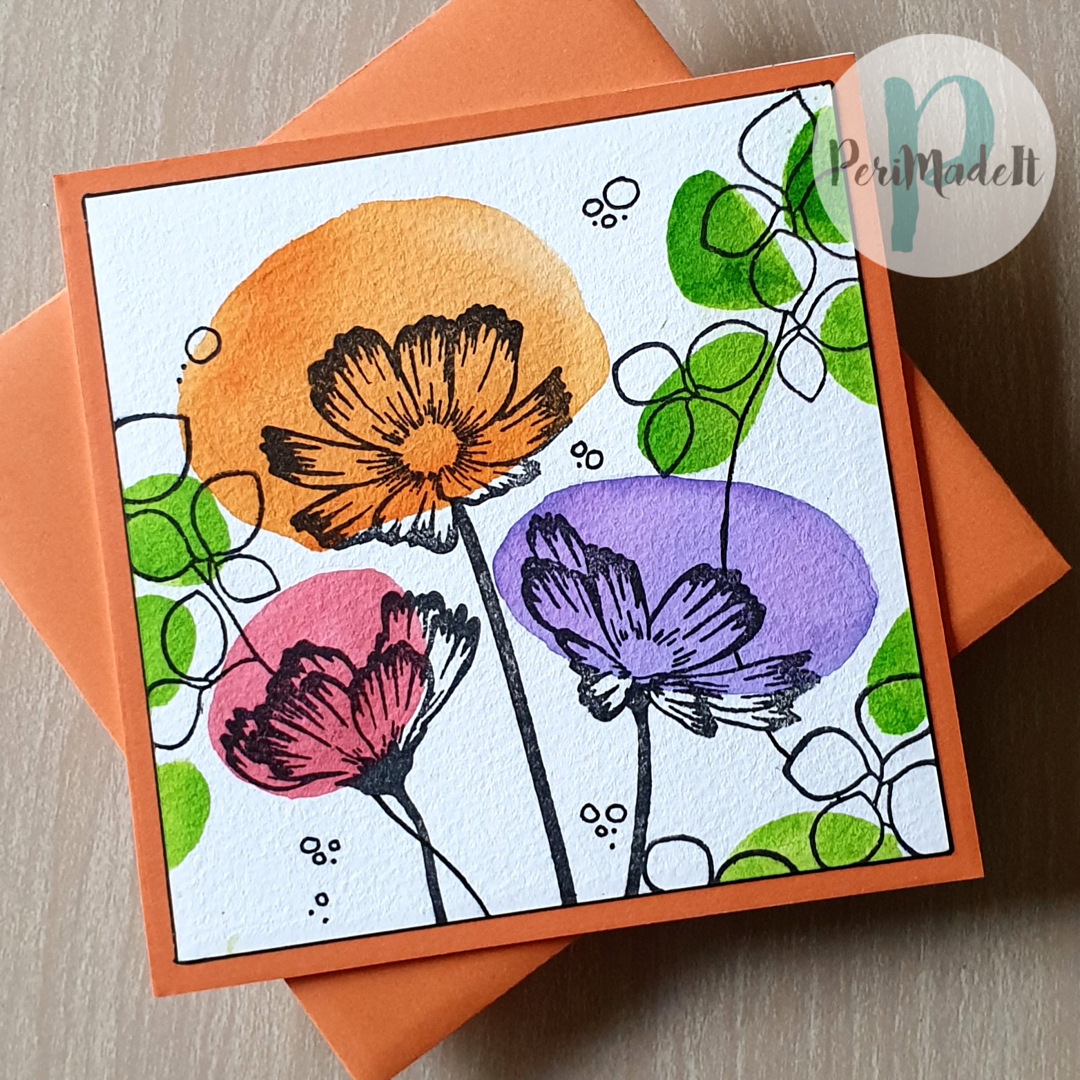
I loved this simple graphic style and was inspired to make my own version - see what you think.


I used Crisp Dye Inks and a water brush to lay down the blocks of colour and dried the panel thoroughly before stamping the flowers and leaf clusters. Like Card One, I felt that there needed to be something dark around the panel, so after I had mounted the panel on my card base, I used a 0.2mm fine liner and literally drew around the card panel - again, just enough definition. 


I hope you've enjoyed seeing my tattoo inspired creations, and I heartily recommend taking Jaycee's class to see what your interpretation might be. 

 Until next time, keep crafting.


Supplies:

Please note that some of the links below are affiliate links and if you follow them and make a purchase I might receive a small commission, at no additional cost to you. This helps to support my blog. 


04 June 2022

Here We Go Again...

Hello Crafty Peeps - a big thank you for stopping by.

Well, it's been a while - there's been a lot of life going on in the background these last few months and I have also been exploring some other styles of card making. But I am now back in Altenew mode and I'm happy to see you at the start of my AECP Level 3 journey. 

If you have followed my blog or social media posts, it will come as no surprise that my first class has been 'Stunningly Styled Stencils', led by the very talented Jenny Colacicco and LauraJane Head. I love stencils and I have used them a lot in my AECP projects. They are an easy way to add interest to a card, or a quick way to add colour to a stamped image. 

For this project I was inspired by lesson 5, 'Stencil Printing' - all the product details, etc., are listed below, as always. Unless otherwise stated, all products are from Altenew.

Card One


I wanted to start by using a stencil in the usual way and then seeing what print I could get from the left over ink. I started out with a piece of coloured/patterned paper - a beautiful clouded green paper from my stash, below. Using a coloured/patterned paper as a base gives a whole new look to the finished design. I used the Leaf Bed stencil and a combination of Green Opal and Green Onyx Crisp Dye Inks (from the Jewel Tones Crisp Dye Ink Set) to make a beautiful deep background paper.


Before wiping the ink off the stencil, I spritzed it with water and placed a piece of watercolour paper over it, pressing down well to pick up the wet ink. You can see the background on the left and the stencil print on the right. 

I made the first card with the dark green background and the Build-A-Flower Honeysuckle Stamp and Die set, with the inks shown in the picture below.


I love these soft peachy tones against the dark background. I cut a few leaves from metallic gold card to add a little shine and mounted the flowers on some foam tape. I completed the card with a foiled sentiment from the Spellbinders Hot Foil Glimmer Place Everyday II set and some gold gems from Little Things from Lucy's Cards.

Card Two


This card is completely different and uses the stencil print I took at the end of creating the background for card one above.


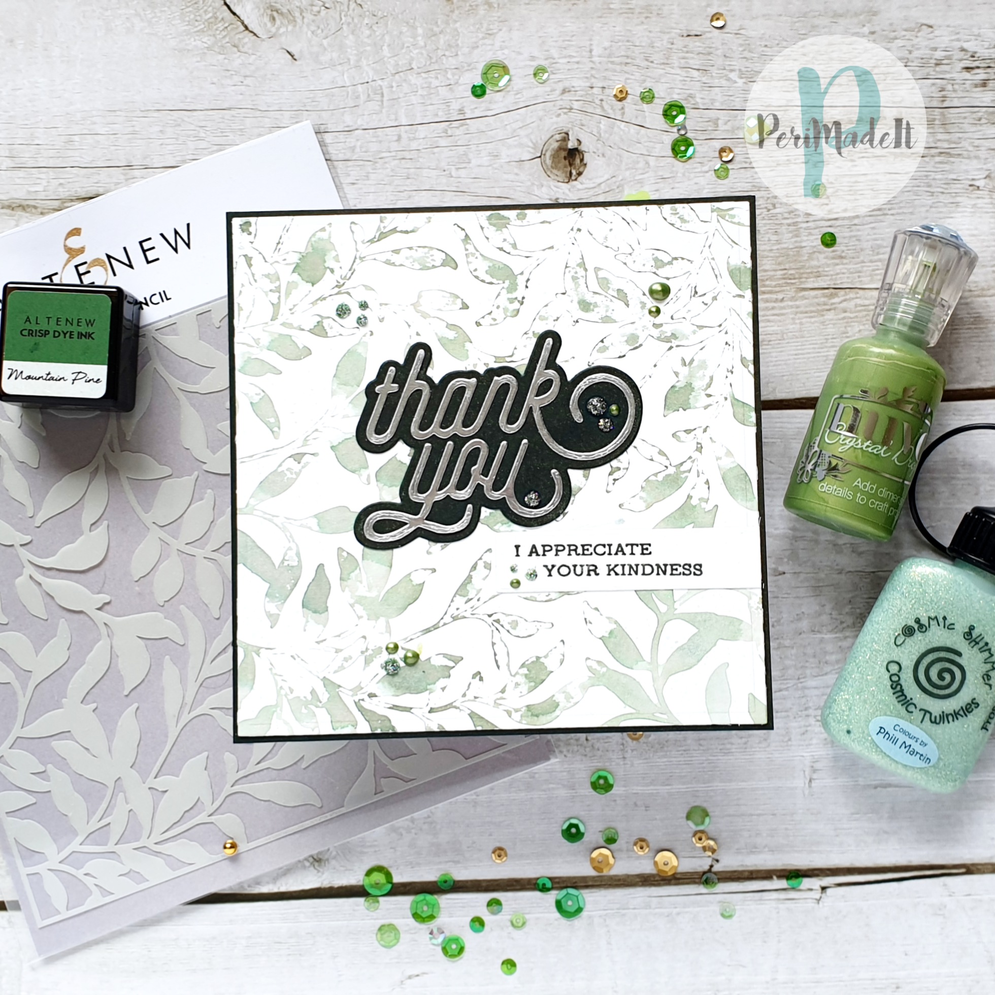
I think the print turned out well and makes a beautiful and subtle background for this card. I used the CZ Design Swoopy Thank You die set for the sentiment and coloured a piece of card with Green Onyx ink to cut for the background. I finished with some dots of Cosmic Twinkles and Nuvo Crystals.

The sentiment is from the Sentiment Strips 2 set but the original sentiment was too long for where I wanted to place it on the card. I tried stamping it and cutting it up, but it looked odd as the spacing didn't work. So I stamped it in two parts by covering the part I didn't want to stamp with washi tape, inking up the remainder, removing the tape and then stamping the inked words - I did this twice to achieve the sentiment on the card.

Card Three


Of course, I couldn't stop there. I wanted to see what the result would be if I intentionally inked up a stencil to take a print so I used one layer of the Deco Diamonds stencil and inked it up with Hickory Smoke, Faded Jeans and Tumbled Glass Distress Inks, to create a sort of ombre effect, then laid over a piece of watercolour paper (for the thickness and softness of the paper, rather than its water-absorbing properties) and ran the whole thing through my Spellbinders Platinum. The end result was a dry embossed and printed background, perfect for a masculine card. What you can't see in the photograph, unfortunately, is the embossing - it really gives a lovely texture.


I used a sentiment from the Note for You stamp set and stamped it in dark blue, to coordinate with the background. I don't know where the die is from, I'm afraid - it has been in my stash for sooo many years.

The effect is quite watercolour-ish, because I used Distress Inks, which don't lie on the surface of the stencil as opaque colour. 

Cards Four and Five


For the next example, I used Distress Oxide inks, and you will see how well they stick to the stencil and what a vibrant print they give. 

I chose the Henna Square stencil and Wilted Violet, Salty Ocean, Mowed Lawn, Fossilised Amber, Carved Pumpkin and Picked Raspberry Distress Oxide inks. After inking up the stencil, directly with the ink pads, I placed a piece of Neenah 80lb paper over to pull the print. This time, I simply rubbed over the back of the paper to pick up the ink and it worked remarkably well:


As there was still plenty of ink left on the stencil after taking the first print, I spritzed with water and lifted another print, which was a beautiful, pale copy of the first.

And, just to make the most of all the ink I had used, I also spritzed the ink left on my mat and ink and blotted it up with a spare piece of watercolour paper, which I will keep to use in a future card.

The boldness of the initial print was stunning but I wasn't sure how best to use it. Then it came to me - much like the original stencil has cut away bits, why didn't I cut away some of the white space to emulate this? So that's what I did:


The gold 'birthday' is the Let's Have a Word: Birthday die from The Greetery and the subsentiment is from Sentiment Strips 2. I think cutting away some of the white and mounting it all on foam pads gives a whole new look to the finished print. A few gold gems finished it off. 

The pale 'shadow print' needed something much softer, which is not my usual style at all. So, I used the Beauty Within stamp set and stamped this in Faded Jeans Distress Ink. I stamped it several times, so that I could use elements to cut out and mount on foam pads, to give a 3D effect. I took my water brush and used the ink in the image to pull some pale colour into various parts of the flowers. I then cut and mounted the extra flowers and was quite pleased with the gently coloured outcome:


I used the largest die from The Greetery's Nordic Frame die set to trim down the background panel and give some interest around the edge. The panel is mounted onto gold card (not much shine in the photograph, I'm afraid) and then onto a pretty pale pink card from my stash, to complement the pastel colours in the background print. I added just a few sparkles to finish.

Of course, I couldn't resist using the stencil in the traditional way, just to show you how it looks against the other examples:


Three very different results from one stencil - what a great technique!

I will definitely use this technique again. It is great for subtle backgrounds and allows you to actually use the negative of the stencil in a creative way. 

Thank you for spending time here, Peeps, your support is much appreciated. 

Until next time, keep crafting.


Supplies:

Please note that some of the links below are affiliate links and if you follow them and make a purchase I might receive a small commission, at no additional cost to you. This helps to support my blog. 


br />


21 September 2021

I Did It!

I'm delighted to say that my Level 2 AECP projects have been adjudicated and I have passed my final challenge. 

Looking forward to level 3 - watch this space.

Until next time, stay safe and keep crafting.


12 September 2021

AECP 2 - Final Challenge Part 2

Hi Crafty Peeps - welcome to Part 2 of my AECP Level 2 Final Challenge post. You can read Part 1 here. 

As a reminder, the first part of the final challenge was to create four masculine cards for various occasions throughout the year and this is the second part - to repurpose/recycle or alter.

Upcycled/Repurposed Item

Our house is full of potential repurposing things and I often repurpose boxes into pretty gift boxes, particularly at Christmas as it is always wonderful to give and receive a beautifully presented gift, don’t you think? But I chose to recycle the case of an old, much-loved but damaged CD.

This is a desk calendar – ‘A Year of Flowers’ – and it sits in the CD case beautifully.

My first challenge was to set up the pages so that I could print the calendar month and a motivational/ thoughtful/funny quotation on each page. I use MS Publisher when need to lay out a page accurately – I find it works better than Word. 

I measured the inside of the CD lid, which came to 12 cm x 14 cm, so I wanted my pages to be 11.8 cm x 13.8 cm, so that I had a little wriggle room when sliding them in and out of the lid. In order not to waste paper, I set up two calendar pages on one sheet of paper and made sure that I was consistent with placement, headings, fonts, etc., throughout. 

You can see how the pages were set out in this screenshot.

Once I was happy I printed the pages onto Make It Colour card – it is so smooth and I love how it takes ink and markers and pencils.

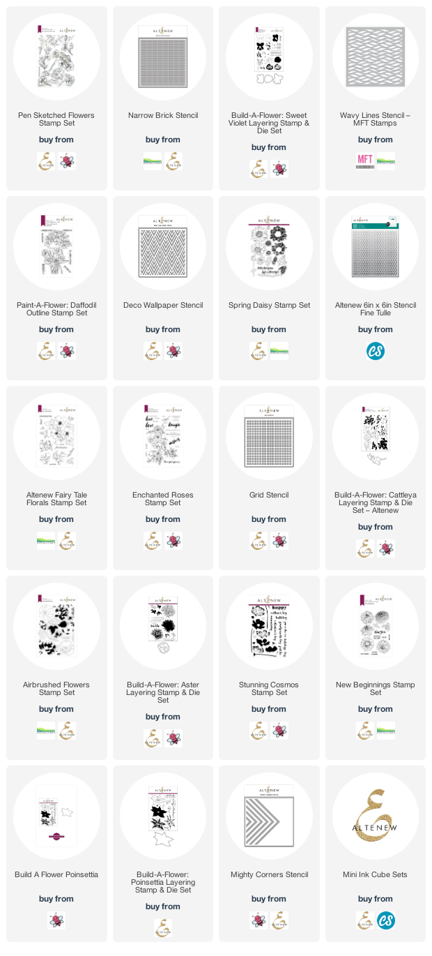
In order to deliver a year of flowers, Mr Google and I worked at finding a list of birth month flowers and came up with the following (plus a note of the stamp sets and stencils used for each page):

January - carnation and snowdrop (Pen Sketched Flowers and Narrow Brick Stencil)
February - violet and primrose (Build-a-Flower: Sweet Violet and MFT Wavy Lines Stencil)
March - daffodils and jonquils (Paint-a-Flower: Daffodil and Deco Wallpaper Stencil)
April - daisy and sweet pea (Spring Daisy and Fine Tulle Stencil)
May - lily of the valley and hawthorn (Fairy Tale Florals and Fine Tulle Stencil)
June - rose and honeysuckle (Enchanted Roses and Grid Stencil)
July - larkspur and waterlily (Build-a-Flower: Cattleya and Fine Tulle Stencil)
August - gladiolus and poppy (Airbrushed Flowers and Deco Wallpaper Stencil)
September - aster and morning glory (Build-a-Flower: Aster and Grid Stencil)
October - marigold and cosmos (Stunning Cosmos and Narrow Brick Stencil)
November - chrystanthemum (New Beginnings and Narrow Brick Stencil)
December - narcissus and holly (Build-a-Flower: Poinsettia and Mighty Corners Stencil)

I had some of these flower stamps already and some that could masquerade as others, so I pulled them all out of my stash and got to work. December didn't get her holly, tho!

I also chose several of my stencils, as I knew I would need them for background interest. I tried to choose quite geometric patterns as a foil to the softness and prettiness of the flowers, as I didn’t want the pages to look too fussy. I also pulled out my roll of Judikins masking paper, as I could tell there was lots of masking ahead! And I think this shows my dedication to fussy cutting!

I cut an oblong mask to mask the calendar part of the page, as I didn’t want any colour over this. Then I stamped around the page, masking where necessary, and masking everything before stencilling the background. 

Once done, I added colour to the flowers in a combination of layers of the layering stamp, Copic markers and coloured pencils.

There’s a little photo-story below of making one of the pages, so that you can see my process:

  • mask the month
  • stamp and mask the flowers
  • stencil over masked page
  • remove stencil and all masks to reveal finished page.

Tip:

Even if you are using a layering stamp set, you can add extra depth and detail with your favourite colouring medium. I used Prismacolor pencils over some of my final images to strengthen the shadows or deepen a colour I felt was a little too light. You can see the difference this has made in the Sweet Violet images - check the page above then see the page below, where I have used coloured pencils to add further depth and colour to the stamped image.

And here are the final calendar pages.


As you can see, the calendar sits really well on its own and as each month passes the front card moves to the back and a new month is revealed. 


Thank you for your time in reading this long post. I hope you have found it interesting and that you might even have a go at repurposing a CD case yourelf.

As always, a list of all the products I have used (where still available) is below.

 Until next time, keep crafting.


Supplies:

Please note that some of the links below are affiliate links and if you follow them and make a purchase I might receive a small commission, at no additional cost to you. This helps to support my blog. 

AECP 2 - Final Challenge Part 1

Crafty Peeps, thank you for popping along to see me.

Today’s is a special post as it is all about the final challenge for my AECP Level 2 certification. It will be a long post so I have divided it into two sections – you can see section two, Altered/Upcycled Item, by following this link.

The challenge consists of two parts, which are:

  1. to make 4 masculine cards on the themes of Love/Thinking of You, Anniversary, Encouragement and Happy Birthday
  2. to upcycle/repurpose/alter an object.

In addition:

  • Select any 3 components from the classes in Level 1 and 2
  • Explain the components I have chosen
  • Share any design tips

My blog post must include a detailed step-by-step photo tutorial and/or YouTube video (still my nemesis, I’m afraid) and there must be a minimum of 10 photographs of the cards and project.

Not much to do then!

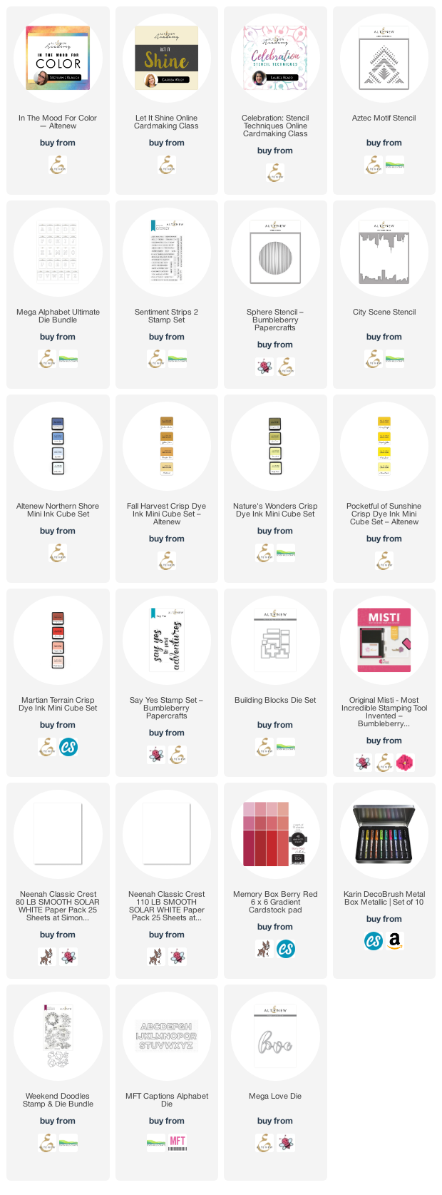
My first task was to decide which components I would include from the 20 classes I had taken so far. I love colour, so one of them had to be ‘In The Mood for Color’, from which I learned how colour really affects the feeling of a card and the message it sends.

Second was ‘Let It Shine’ – where would we card makers be without a bit of bling? A simple thing like adding a little sparkle can lift almost any card to the next level. It can provide an easy win when your mojo is flagging, and there are so many interesting ways to use the various shiny products in your stash.

And third I chose ‘Creative Stencilling’ because I love stencils! I love the ease with which stencils can change the feel of a whole card or project: got a climbing flower that looks a little lonely on the front of a card? Then stencil a trellis or a brick wall for it to climb up and you have instantly boosted your card to the next level.

Of course, it’s not possible to create without using elements from other classes: layering stamps, making your own backgrounds, inking tips and tricks, and much more along the way. The 20 classes have provided such a lot of brilliant tips and techniques.

My next task was to look through my Altenew collection to see what inspired me. I chose to interpret the brief as 4 cards that someone would send to a partner at different times of the year so I didn’t want to make the cards into a set, i.e. have them all look somehow related to each other.   That made it easier to pick the stamps and stencils I would use, and gave some scope for design.

Card One – Happy Birthday

The first card I made was the birthday card. I chose the ‘Aztec stencil’ for this as it is beautifully graphic and a great pattern to repeat across a card front. Using masking tape/Post-it tape, I masked off parts of the stencil as I applied ink with finger daubers for a little more control and used my favourite ink sets to apply bold colour. I was happy with the result – it really popped, as you can see.


I used Altenew Mega Alphabet dies H and B to cut out the two large letters. I also cut an additional three of each of the letters from white card and stacked these together before adding the stencilled letters on top.

Tip:

When stacking die cuts for dimension, cut the extra layers in white card, stack them together and then, before adding your top layer, take an ink pad that matches or coordinates with your top layer and ink all around the edges of the stack. There will be no white edges showing around your stack.

I originally wondered whether I should make an eclipse card but I wanted a bit more contrast between the letters and the background so I inked the stencil again with Sea Glass ink. I also cut another set of letters from gold mirror card from my stash as I wanted to offset the H and B to give a little more interest to this simple design.

Tip:

When inking/stencilling/stamping for a background like this, always ink a piece larger than you need. It allows you to pattern match with the background more easily – see below.

When I inked the stencil again in Sea Glass Ink, I made sure to ink a piece that was larger than I knew I would need in the end. The reason for this is that I wanted to match my letters to the pattern underneath, but didn’t know how much of the stencil I would need to do that. So inking a larger piece gave me options.

I added the top layer to my stack and then tried the letters against my background, making sure to line up the patterns. I lightly drew around the letters to give me placement then offset the letters against the gold card. It wasn’t until I had everything glued in place that I realised the offset was to a different side on each letter! But, go with the flow – it’s actually okay and it shines!

My final step was to stamp and heat emboss a sentiment from Sentiment Strips 2 to place across the two letters. I chose ‘Have a super day’ and embossed it in white on medium blue cardstock from my stash. A co-ordinating envelope finished this off beautifully. 

Card Two - Encouragement


My second card was the encouragement card. For this I used a combination of bright yellows and pink, with black contrast, for a happy and graphic feel. 

I first blended ‘Citrus Burst’ ink onto a 4.25” x 5.5” piece of Neenah Solar White 80lb paper with my blending brushes to give all over coverage. Then I swiped my ‘Honey Drizzle’ ink cube across the paper to leave streaks of darker yellow from side to side, for a little visual interest. I used the Sphere stencil and some Canyon ink to create some sunset interest in the centre of the panel before using the City Scene stencil and some Memento Tuxedo Black ink to lay down the city scape across the bottom of the panel. I added a second city layer in grey ink for extra depth.


I chose to extend the black area down the card to give somewhere to show a little reflection by swiping a white pigment ink pad gently downwards from what I determined was the base of the city buildings, first masking a straight line with some wide Post-it tape. 


I chose the sentiment ‘Say yes to new adventures’ as I felt this card represented something fun and new and exciting – the yellow really pops.  I stamped the sentiment in black Versamark pigment ink and heat embossed with clear powder.

A few gold crystal gems added some extra sparkle and a co-ordinating envelope finished this brightly‑coloured card. 

Card Three - Anniversary

Card number three was my anniversary card and I was excited to use my Blocks die set for the first time.


From some thin copy paper I cut three sets of blocks – because the paper was so thin I was able to layer the sheets together and cut all three sets at once. In the back of my sketchbook I worked on arranging the pieces until I had made a complete rectangle with the blocks, and I used this as my guide whilst making the card itself.

Rather than cut blocks from several different colours of cardstock, I chose to cut two complete sets of blocks from Neenah Classic Crest Solar White 100lb paper and then coloured each block using my finger daubers and Altenew inks from the Martian Terrain, Northern Shores, Natural Wonders and Pocketful of Sunshine mini ink cube sets. I cut an extra piece in gold mirror card from my stash and two further ones of the same shape in white card, which I layered with the gold for dimension. 

Using the pattern I had made as a guide (with just a couple of adjustments), I used the corner of my MISTI to help me keep the panel square as I assembled it, sticking the pieces onto a piece of copy paper to give them stability. I generated my sentiment in MS Publisher (easier placement than Word) and printed it onto 300gsm white cardstock, which I folded to make a card base. I adhered the ‘puzzle’ panel onto the card, leaving a small border of white at the top , and then attached the ‘missing’ piece on top, leaving some of the empty space visible below to give the impression that the puzzle needs to be completed.

Another co-ordinating envelope and card three was complete.

Card Four – Love/Thinking of You

The fourth and final card was on the theme of Love and, actually, I found this the most difficult to create of all the cards as I didn’t want anything too floral, too cute, too masculine, too feminine…need I go on?

Eventually I decided simply to begin and see where the process took me. I took a 6” square piece of pale red (i.e. not too saturated colour) card from a Memory Box Gradient Pad and began blending ink onto it with my blending brushes, using Velvet, Crimson and Grape crisp dye inks, until I achieved the depth and gradient I was looking for.

Then I took the Weekend Doodles stamp set and stamped the flower sprays at the bottom and up the sides of the card in Dark Chocolate ink – a little softer result than using black ink. I was not sure how to colour the flowers until I remembered my Karin Metallic Brush Pens and I found these gave a lovely sheen on top of the red ink. I did some quick colouring and then stamped the outlines again to define the flowers. 


I used the Mega Love die to cut the word twice from white cardstock and once from gold glitter paper, layering them all together for dimension. Per my tip above, I first glued the two white die cuts together and took the Dark Chocolate ink pad and swiped around the edges of the stack so that there were no white bits showing to break up the colour underneath. Then I added the final gold die cut and placed it on the card. I think perhaps I could have placed it further to the left, even if it obscured the flowers a little, as the placement bothers me slightly – but I think the overall final look is great and perhaps it’s the sort of thing that only we cardies would notice? 


I cut the word ‘You’ from gold mirror card with MFT’s Captions Alphabet Dies and added it without dimension (!) underneath the main die cut.

I added a few sparkly crystals from Lucy’s Cards and made a co-ordinating envelope, as always, to finish off.

Thank you for sticking with this long post - I really appreciate your time. Don't forget to check out part 2 here.

 Until next time, keep crafting.


Supplies:

Please note that some of the links below are affiliate links and if you follow them and make a purchase I might receive a small commission, at no additional cost to you. This helps to support my blog. 


>